
Cloud Dancer (Pantone Colour of the Year 2026): How to Style with Off-White in Your Home

Interior Styling Blog for Real Homes: Ideas, Advice & Inspiration
Hi, I’m Sandra,
If you're in awe of stunning interiors and crazy about home decor, you’re in the right place. As an interior writer with a background in styling and photography for leading magazines around the globe, as well as an avid home renovator, I am here to help all you interior enthusiasts to style and decorate your home with ease and confidence, like a pro.
On this blog, I’ll be sharing insightful articles packed with advice, tips, and ideas for home styling and decoration, along with inspiring tours of beautifully styled spaces. Having styled countless homes with very different interiors, I know it’s the final touches and thoughtful curating that make a space magazine-worthy, regardless of whether it’s an architectural masterpiece or filled with high-end furniture. And, rather than focus on one particular interior look or style, I aim to open your eyes to a wide variety so you feel inspired, not limited. Ultimately, I’ll show you how a little bit of styling can be transformational and take your home to a whole new level.
In this article, I will be looking at Pantone Colour of the Year 2026: Cloud Dancer and why I think it is a great choice for homes, with tips to bring it into your own home.
HOW TO BRING OFF-WHITE INTO YOUR HOME
The much-awaited Pantone Colour of the Year 2026 was recently announced as Cloud Dancer - an ethereal soft off-white described as billowy rather than stark. According to Pantone, their choice serves as a symbol of calming influence in a frenetic society, rediscovering the value of measured consideration and quiet reflection. Pantone also referred to the off-white shade as similar to a blank canvas, signifying our desire for a fresh start. Many journalists were not convinced and took to social media to voice their opinions, calling the choice tone-deaf, while others said it’s not a trend the interiors world should follow. Some journalists commenting were so young they have never picked up a paintbrush or opened a tin of paint, so I wonder how they can be negative about an off-white so often used in interiors.
At the end of the day, Cloud Dancer is an off-white, which although many argue it’s not an actual colour, it has proven time after time to work so well in interiors. Shades of white are popular because they’re useful, not because they’re exciting. Using off-white is not about following a trend. You can simply use it to make your home feel calmer and lighter. And if you’re on Instagram, you’ll know that off-white interiors are often on our feeds, where influencers waltz into an off-white room in floaty off-white linen trousers to fluff up the cushions of an off-white sofa!
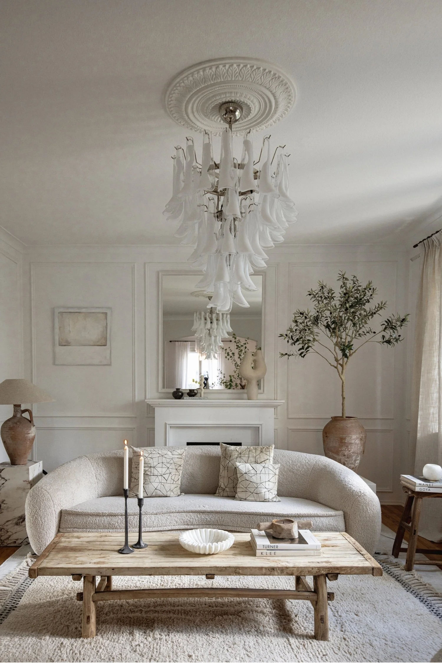
Interior designer Katie Fischer, whose gorgeous off-white interior scheme is pictured above, points out that off-white works so beautifully because it’s timeless. “Trends come and go, but soft neutrals always feel elegant and effortless, no matter the season,” explains Katie. “They give interiors longevity and make it easy to layer pieces over time.” Notice in the image how Katie adds natural, rustic elements, like the stone pot and wooden coffee table. These organic materials pair beautifully with off-white.
Pantone’s pick isn’t just for interiors – it’s also for the fashion, product and design world. And while it’s been a long time since I worked for fashion magazines, I do think it’s telling that most of us own at least one (usually several) off-white wardrobe basic, such as a shirt, tee, or summer dress.
So, here’s why I’m on the positive side of Pantone’s choice for interiors, as my take is that it’s a tool and, unless you live in a fully colour-drenched space, most rooms include something pale somewhere, and that’s because interiors need contrast. Light against dark. A place for your eye to rest. And this choice of colour doesn’t have to mean we have to paint everything off-white. It could be through a piece of furniture, a lamp, a rug, curtains, so you get the contrast without committing to a full scheme. Here is a quick list of items you could introduce in off-white, followed by images and more comments from the experts on using the shade in your home.
QUICK CHECKLIST: WAYS TO BRING TO BRING CLOUD DANCER INTO YOUR OWN HOME
AN ACCENT CHAIR
Is the ideal way to bring off-white into your interior, to make a statement without fully committing to a larger piece like a sofa.
LAMP OR LAMPSHADE
A simple way to bring off-white into your interior with either the base or shade, or both.
CUSHIONS AND THROWS
A good way to pair with another off-white item, such as a lamp or curtains, and to test whether you like the tone in your home’s light.
VASES AND VESSELS
The easiest way to introduce or tie in off-white with other pieces.
CURTAINS
Off-white curtains, especially sheers, work with so many schemes and always look stylish.
SOFA
An off-white sofa is a classic, and I bought one recently. You can bring in your own choice of colour with cushions and throws.
HEAD-TO-TOE IN CLOUD DANCER TONES
This interior features only Cloud Dancer tones and comes from Caffe Latte, a Portuguese brand with elegant contemporary pieces that have graced the pages of AD and Elle Decoration. I reached out to the design team to get their take on using off-white in interiors. "Off-white brings serenity into a space. It softens the atmosphere, amplifies light, and creates an inviting sense of comfort. Much like Cloud Dancer, it reflects a desire for calm, focus, and harmony - qualities that define truly luxurious interiors."
Photo: Caffe Latte
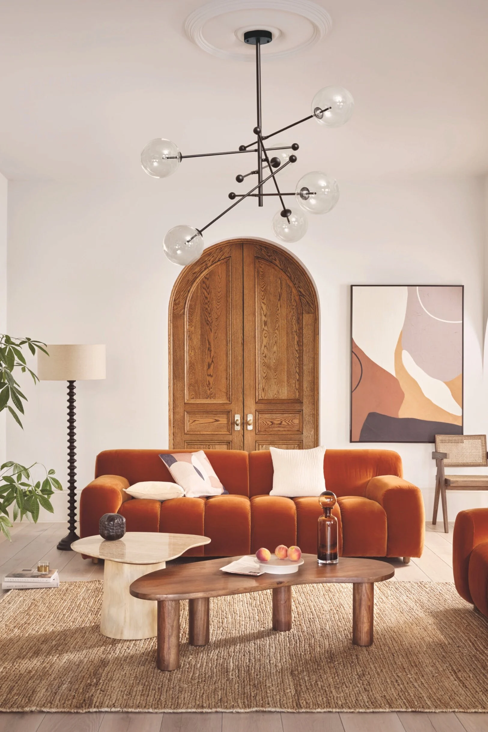
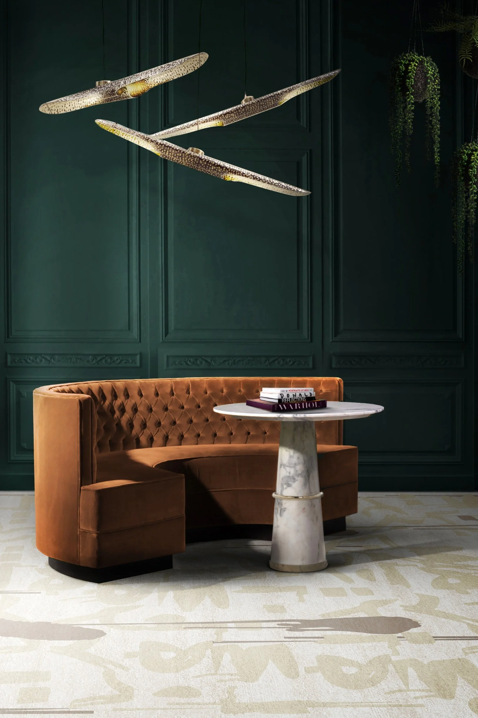
OFF-WHITE WALLS TEAMED WITH A BURNT ORANGE SOFA
If you have off-white walls but are drawn to coloured furniture and still want it to look sophisticated, opt for pieces like the burnt orange sofa pictured here. Head of Product & Displays at Barker and Stonehouse, Magdalena Gierasinska, suggests adding a touch of contrast with pieces in earthy clay shades, which anchor the palette yet still feel grounded. The result is a space that feels effortlessly balanced, serene, and enduringly elegant. She also suggests dialling up the texture. "While the colour itself is pared back, ramp up the texture when styling at home – think faux furs, sheepskin and bouclé – these tactile materials all beautifully enhance the soft, serene and ethereal qualities of Cloud Dancer. Pair it with rounded silhouettes, ceramic accents, or soft-toned marbles for a harmonious and cohesive style.” The key takeaway here is how earthy-toned furniture looks striking with an off-white backdrop.
Photo credit: Barker & Stonehouse
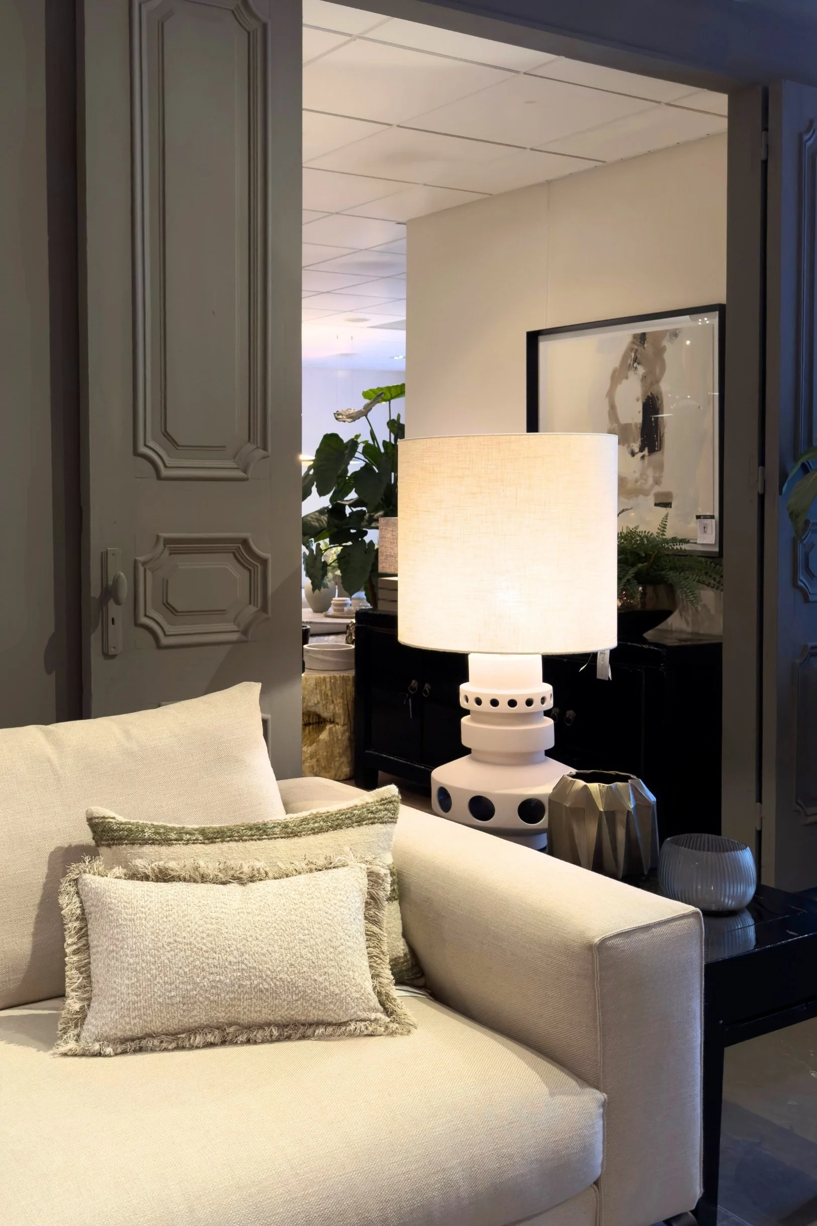
OFF-WHITE SOFA, CUSHIONS, AND TABLE LAMP AGAINST A DEEP-TONED BACKDROP
The Dutch do off-white in a beautifully intentional way that’s never stark. Here, an off-white sofa contrasts against a rich grey-brown backdrop of the doors and wall - a shade you’ll often see in Dutch paint brands - which instantly adds depth. While it has grey undertones, it is warmer, more earthy. With such a dramatic colour behind, the cushions remain off-white, but vary in texture and are embellished with a stylish trim. Even the lamp plays its part in the interior scheme which is all about using off-white as a contrast to the darker tones. If you are styling with off-white cushions on an off-white sofa, take a cue from the sofa pictured here and mix different textures and/or toned trims.
Photo: Sandra van Aalst
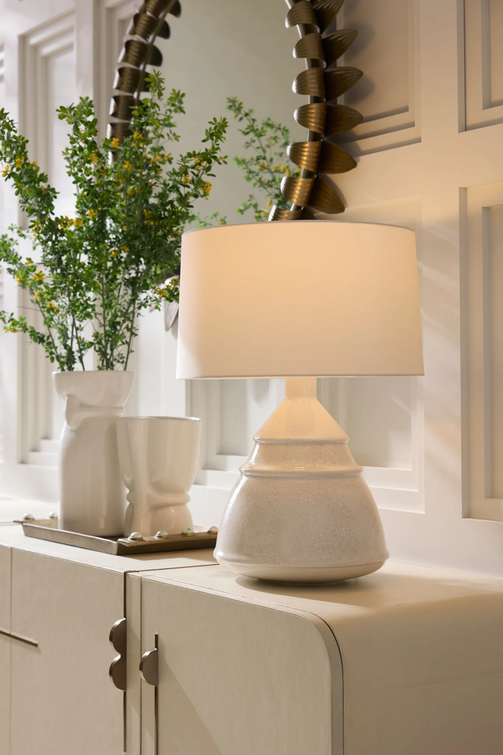
OFF-WHITE TABLE LAMP AND VASES
One of the simplest ways to bring off-white into a space is with table lamps, vessels and vases like the gorgeous ceramic ones here by Arteriors. The key to choosing accessories in off-white tones is to opt for pieces with texture and shape, avoiding anything too flat and mass-produced. So the styling takeaway here is to look for natural shapes and forms that look handmade with finishes such as ribbed, patterned, uneven or chalky.
Photo credit: Arteriors
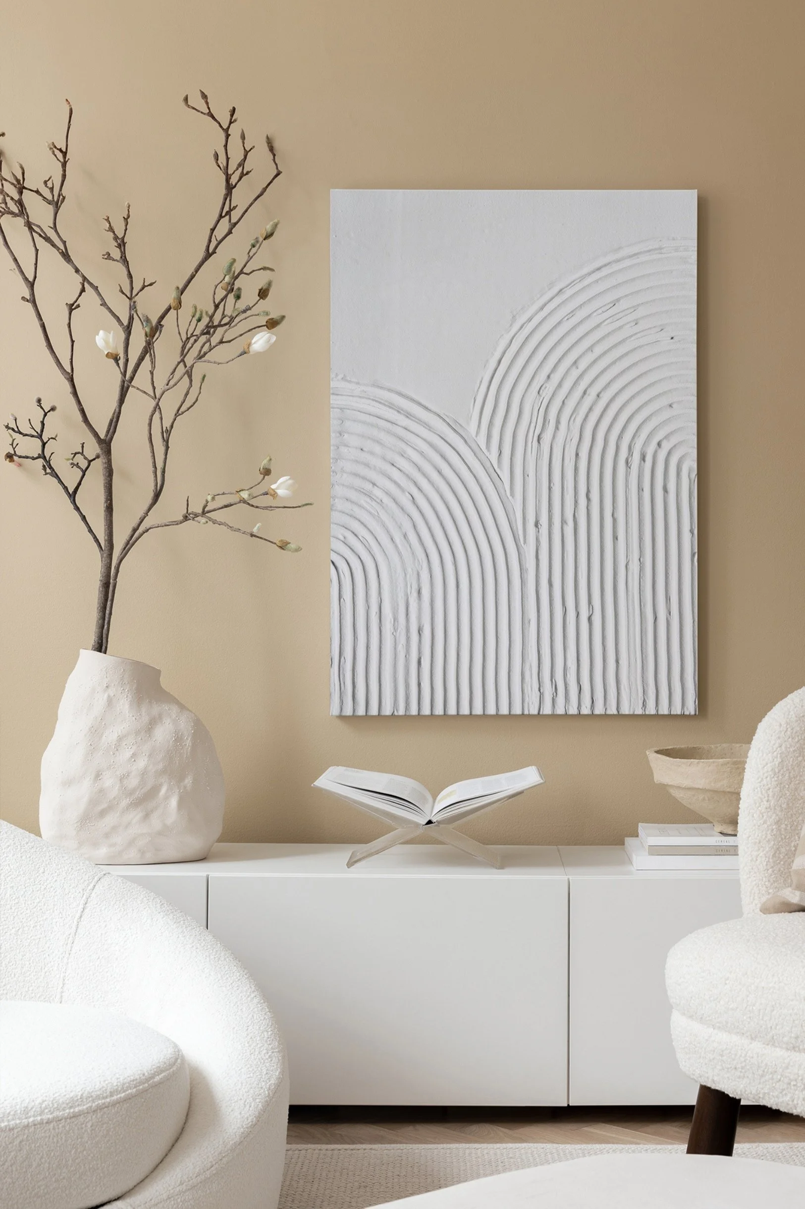
ART AND ACCESSORIES
Home decor and art are a great way to incorporate off-white tones and add contrast to your room. You could try pairing a canvas or print with an item of furniture such as an accent chair, or simply with an off-white cushion to tie the look together for a more cohesive feel. The abstract canvas pictured here by Desenio is ideal as it’s all white, but if you have a colourful print with a white frame and border, that will also do the trick.
Photo credit: Desenio
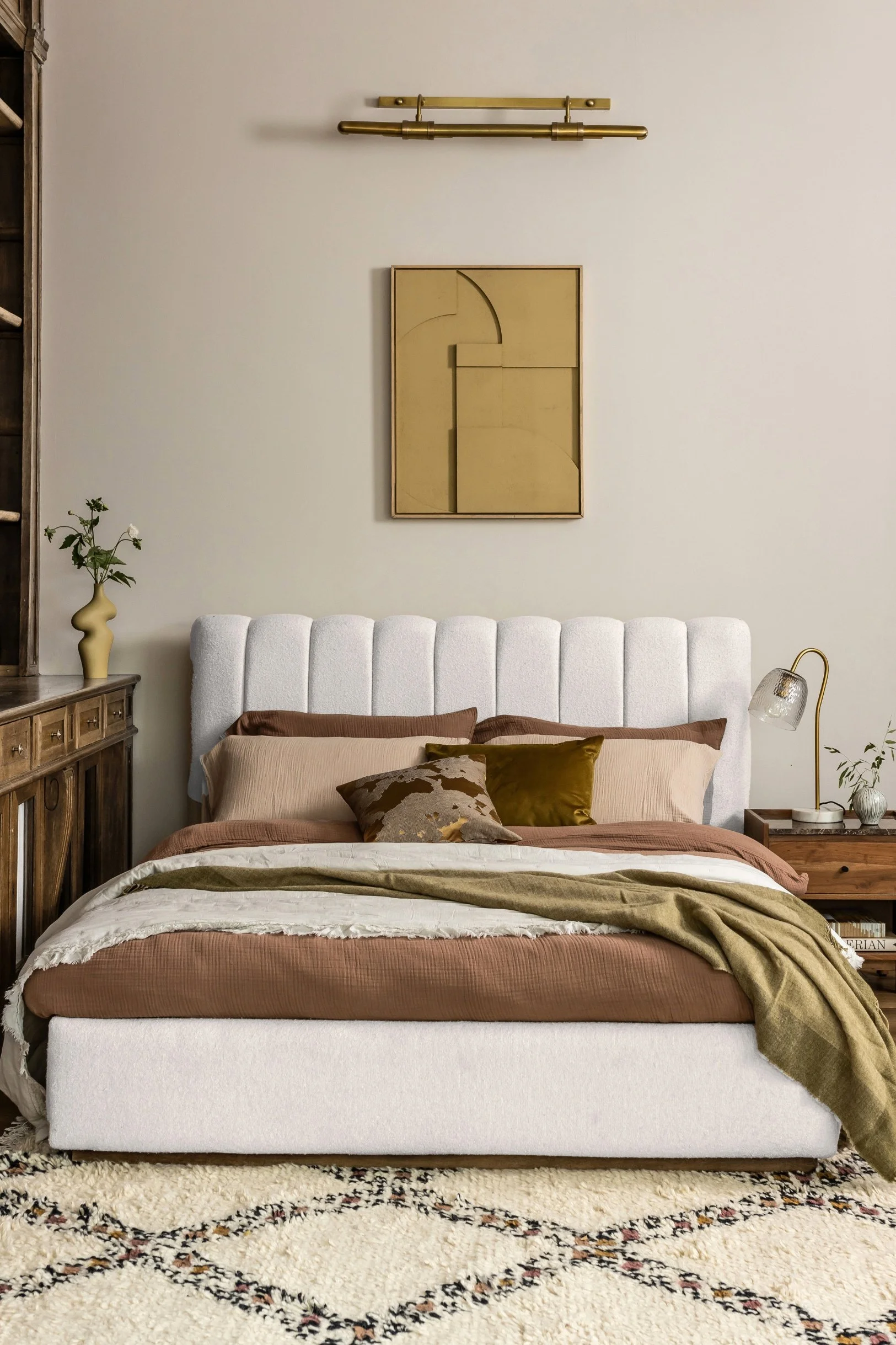
OFF-WHITE BED FRAME AND HEADBOARD
A headboard or bed frame can bring off-white into the bedroom, especially if you want darker tones, wallpaper or a colour on your wall. This bed by Atkin and Thyme has been upholstered in tactile looped bouclé in off-white, with a plush fluted headboard. It works well with the neutral-toned wall behind and the brown and green bed linen, showing us again that Cloud Dancer tones are a good base for the earthy, warm shades that are so popular at the moment.
Photo credit: Atkin and Thyme
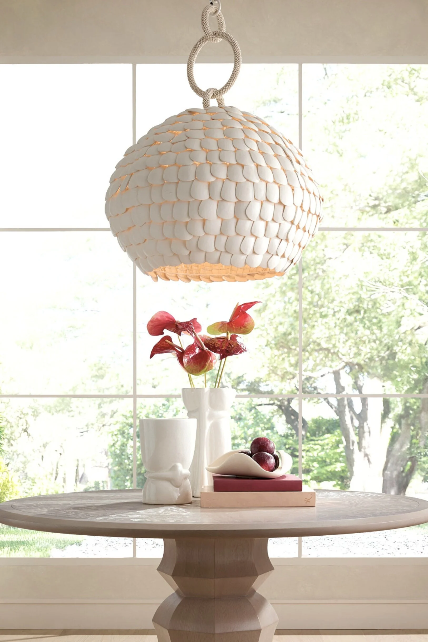
TEXTURAL OFF-WHITE PENDANT LIGHTS
This statement pendant light, made by overlapping layers of coconut shells, is a perfect example of how off-white can be used in richly textured materials with a stunning effect. Far from flat, when lit, it lets light filter through in soft patterns. The light pictured here is by Arteriors, and because of its texture, still stands out in an off-white interior. The key takeaway is to have textiles that have depth and interest for a fresh and organic look.
Photo credit: Arteriors
BRINGING IN OFF-WHITE WITH A RUG
An off-white rug is another brilliant way to incorporate Cloud Dancer tones into your home, especially if you have dark walls as shown in the image here. The soft tone of this plush rug really lifts the overall aesthetic, especially teamed with another off-white element, like the marble table in the image, which ties in beautifully with the rug. This particular rug by The Rug Society features subtle markings in neutral tones, which are actually a tribute to tattoos, bringing them in a creative way into interior design. It’s an example of how off-white can act as a grounding base for deeper neutrals, while also brightening up an otherwise dark interior.
Photo credit: Rug’Society
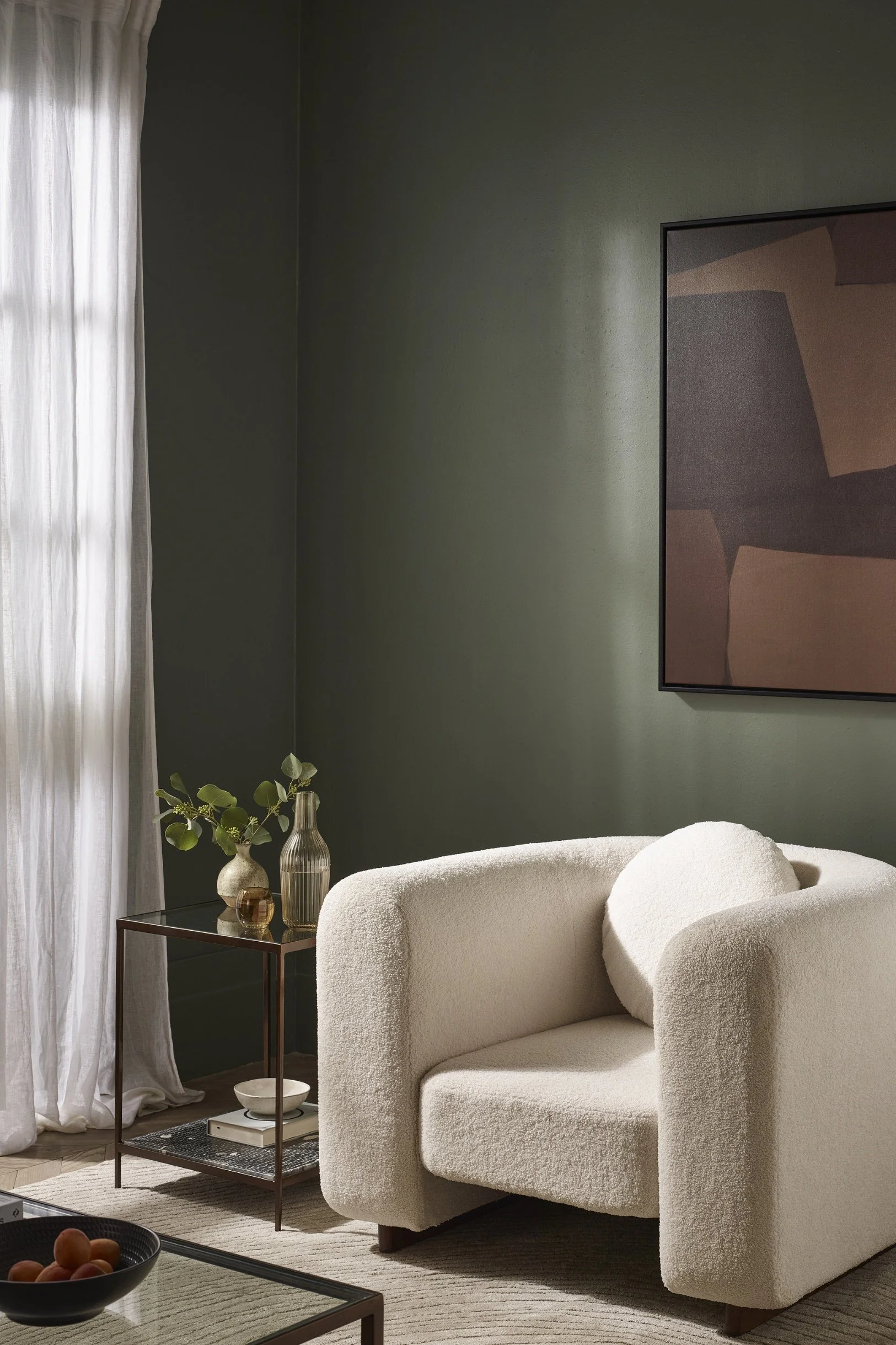
OFF-WHITE ACCENT CHAIR AND CURTAINS COMBINED WITH COLOUR
The armchair and sheer curtains pictured here really stand out against the olive green wall. Both are similar off-white tones, which give a sense of cohesion, but most importantly, they balance out the depth of the green. Off-white allows bolder colours to shine while still keeping the overall look stylish. This off-white chair by Atkin and Thyme doesn’t compete with the green but instead enhances it, as do the curtains. So the takeaway here is how off-white looks simply stunning teamed with a rich colour.
Photo credit: Atkin and Thyme
LET’S SUM UP
Hopefully, you can see from this article why off-white is a staple, which is why the backlash around Cloud Dancer feels slightly misplaced. Last year’s Pantone Colour Of The Year 2025, was Mocha Mousse and it was fascinating to watch brown surge everywhere from paint colours to cushions, sofas and wallpaper. I’ve written more about incorporating brown - often paired with off-white - into your interiors in the following post: www.interiorstylehost.com/blog/brown-interior-ideas-inspiration