
Dining Area Makeover: Styling, Decoration & Before-and-Afters
Interior Styling Blog for Real Homes: Ideas, Advice & Inspiration
Hi, I’m Sandra, this blog is about interior styling and decoration for real homes. If you love interiors and want your home to feel stylish, pulled together, yet still personal, you’ve come to the right place.
I’ll be sharing practical styling advice to help you edit, layer, and finish your home with confidence, alongside articles on what’s happening in the interiors world — from design events to colour stories - so you get the full picture. I also take you on tours of beautifully styled homes from around the world, offering inspiration and styling ideas to steal for your own space. Ultimately, I’ll show you how a little bit of styling can be transformational and take your home to a whole new level.
In today’s post, I am going to show you my dining area makeover.
MY DINING AREA REFURB AND RESTYLE
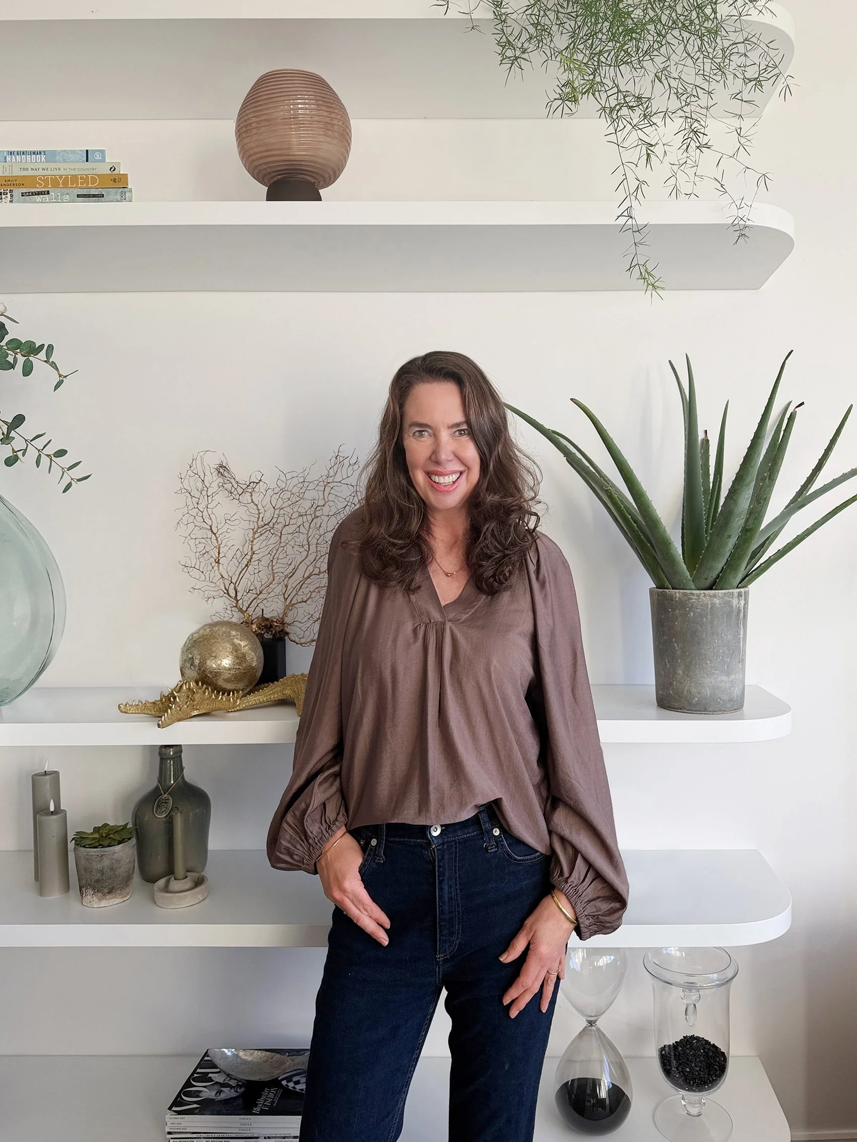
Photo credits: Sandra van Aalst
It’s that time of year when we often start thinking about refreshing a room, so I thought I’d share my dining area makeover with you. Having moved into my house five years ago, the first changes - which happened that year - were practical ones. This included swapping out internal and external doors, and replacing the cream carpet (rapidly turning brown from muddy dog paws) with ebony wood flooring.
So, where did my design and style ideas for the dining room stem from? It really started a few years ago when I photographed a home that appeared in Elle Decoration. It had those imposing Crittall-style framed glass doors throughout the ground floor, and ever since, I had been dreaming of having something similar in my own home.
The dark floors were inspired by a work trip to Los Angeles, where I was smitten by the cool Venice Beach style. The trip sparked a deeper dive into LA homes, especially by watching Architectural Digest’s Open Door - a series of videos where celebrities give you a tour of their homes. I discovered that Alessandra Ambrosio’s house, Kendall Jenner’s and Ashley Tisdale's all had those beautiful dark floors. So, as my house was an upside-down layout with a sea view, I knew I wanted LA style with a coastal twist.
Before you make design decisions, it’s important to look at lots of different areas of inspiration. Interior magazines, Pinterest and online home stores are great, but it’s also the less obvious places, like hotels, that help spark creative ideas. You don’t need to visit the hotel or stay the night, just touring their websites can reveal amazing interiors that translate into a home setting. To help you gather ideas and get inspired, check out my interior inspiration blog post
Now, let’s take a look at my dining area revamp and restyle.
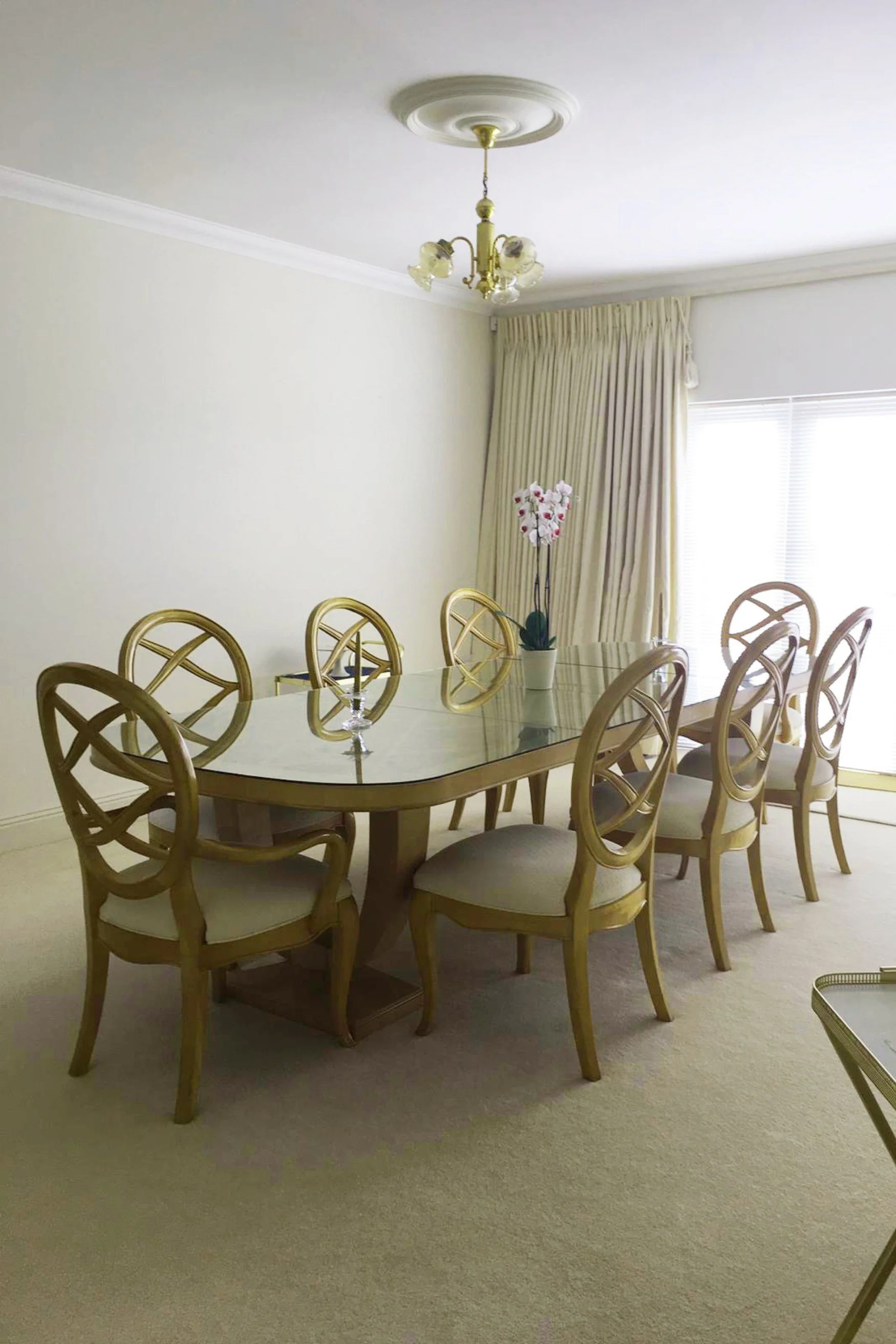
BEFORE: Estate agents shot
When I first viewed the dining room I was struck by how spacious it was, but with just one large table, an undersized pendant light and bare walls, it felt rather empty. The real bonus was the large balcony with a sea view, though, surprisingly, the view was almost completely blocked by vertical blinds covering the doors that could not be pulled aside. So, on the day I moved in, I grabbed a pair of scissors and snipped them off!
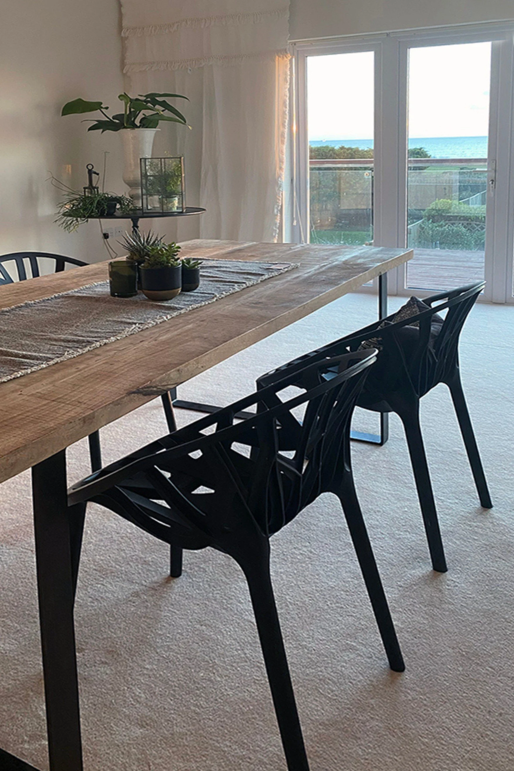
BEFORE: Furniture moved in
Once the previous owners' furniture was moved out, I brought in my own table and chairs so we had a place to sit and eat. With the extra-high ceilings, I knew that widening and raising the door opening would completely transform the room and make the most of the beautiful view.
As much as I loved my mango wood table and black Vitra chairs, the wall-to-wall carpet kind of killed the look, while the short, chunky PVC doors and rotten wooden balcony didn’t make the most of the view. I had to live with it for a few months while the doors were being constructed, so in the meantime, I added my side metal table from Rockett St George and styled both tables with a few plants to give the space a more lived-in, intentional feel.
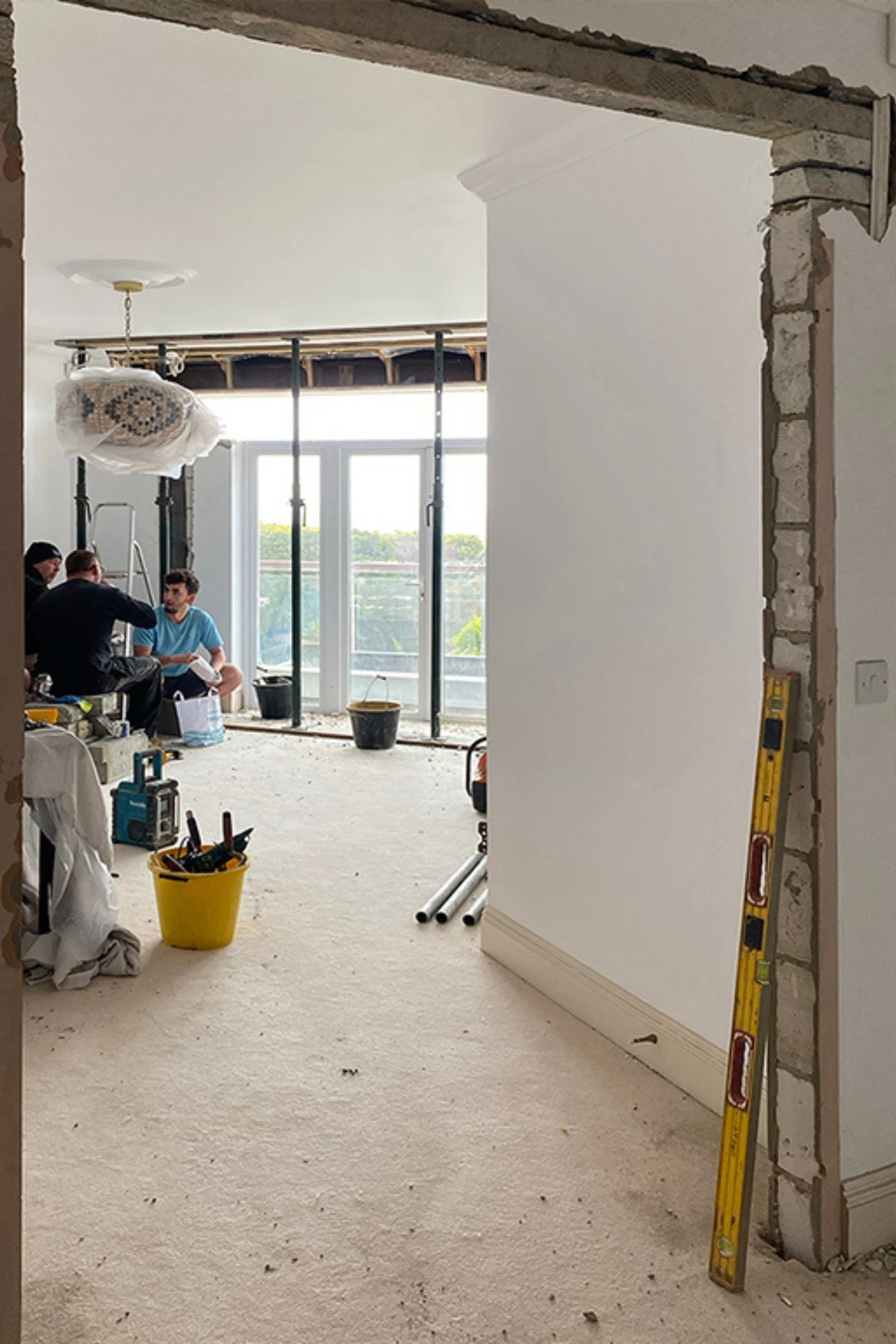
DURING: Door removal begins
The structural change was to replace the doors with much larger ones, so it was necessary to install a huge steel beam above where the new doors were to go. Here are the builders having a break before hoisting it into place. The internal doors leading into the hallway were double doors, but short, stubby and old-fashioned, so these came out too. I replaced them with the same design as the exterior doors to give a cohesive feel between the dining room and living room.
I had carefully measured the height of the doors to be as tall as possible to make the space feel more balanced, light and airy. If you are changing doors, even if they are not glass, extending the height shifts the proportion and maximises the sense of space. Most rooms can benefit from this, unless low ceilings are a feature in a house, such as a cottage.
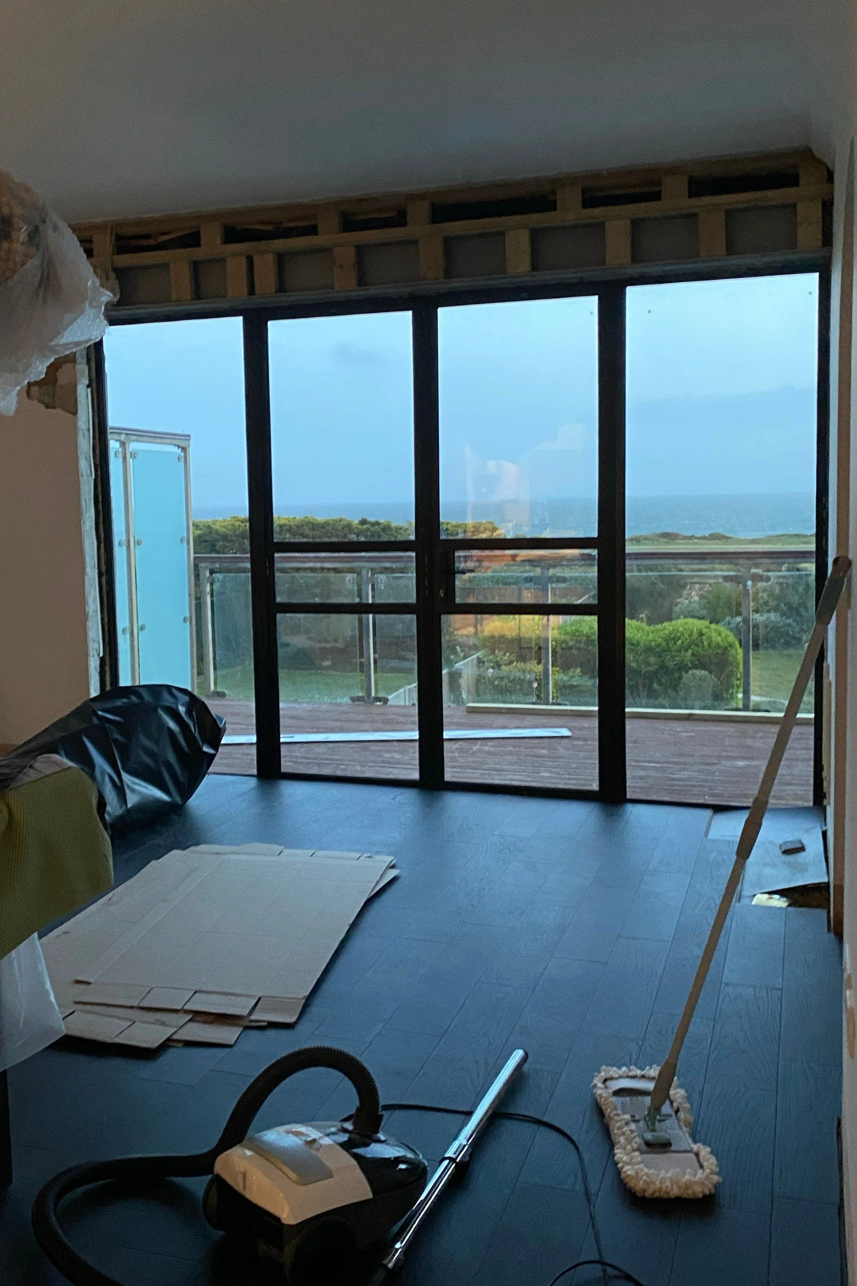
DURING: Doors and wooden floor installed
Now you can really see the transformation take place. My dining room faces the sea so while I love the look of Crittall-style doors, steel simply wasn’t an option due to the salt air which would cause it to rust in no time. Instead, I chose aluminium frames with marine grade paint, which, although not as slimline as steel, were the best option for an exposed location.
For the colour, I wanted a very dark grey, but not quite black, so I opted for RAL number 7021. It’s a darker grey than anthracite, which I had used in my last house, and it soon became my signature shade both inside and out, from the front door to the staircase, the garden, and all external windows and doors.
As for the flooring, I sourced the ebony-toned engineered wood, and helped the floor layers place almost every piece! Five years on, I’m still very happy with how it looks and how it has held up - it’s both stylish and surprisingly practical.
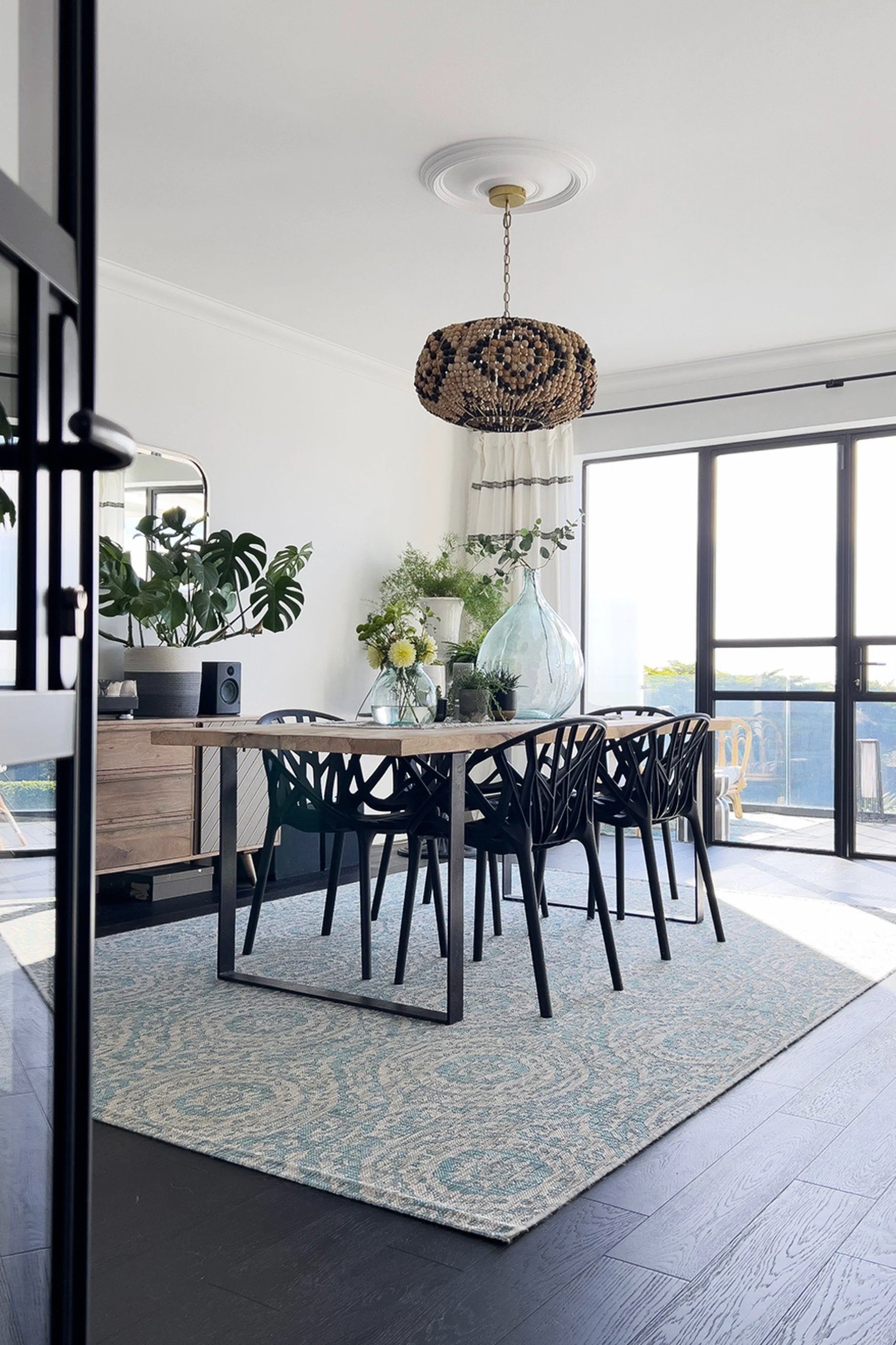
DURING: Styling and decoration first phase
With both the new external and internal doors in place, and the walls freshly painted in white, the dining room was really starting to come together. When it comes to paint, I often start by painting everything white until I have lived with it for a while and know how it works with the light and my furniture. Together with my table and chairs, I added an old sideboard aka credenza that was a temporary piece until I had figured out exactly what I wanted in the space.
The balcony had also been transformed with dark composite to look like wood, which is longer lasting and hard-wearing. I laid it vertically rather than horizontally to extend the room, making it feel like an extension of the interior.
One new addition I am very pleased with is the rug. It’s actually an indoor/outdoor rug that is perfect for under a dining table. Outdoor rugs can be a little on the thin side, so I added a rubber underlay to give it more plushness and feel softer underfoot. I made sure the rug was big enough so when all the chairs are pulled out they still sit comfortably on the rug. Getting the rug size right is important to make a room look balanced and furniture grounded, so always ensure you measure well before purchasing one so you can be sure it will work in the space.
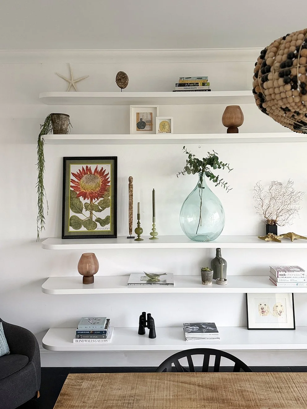
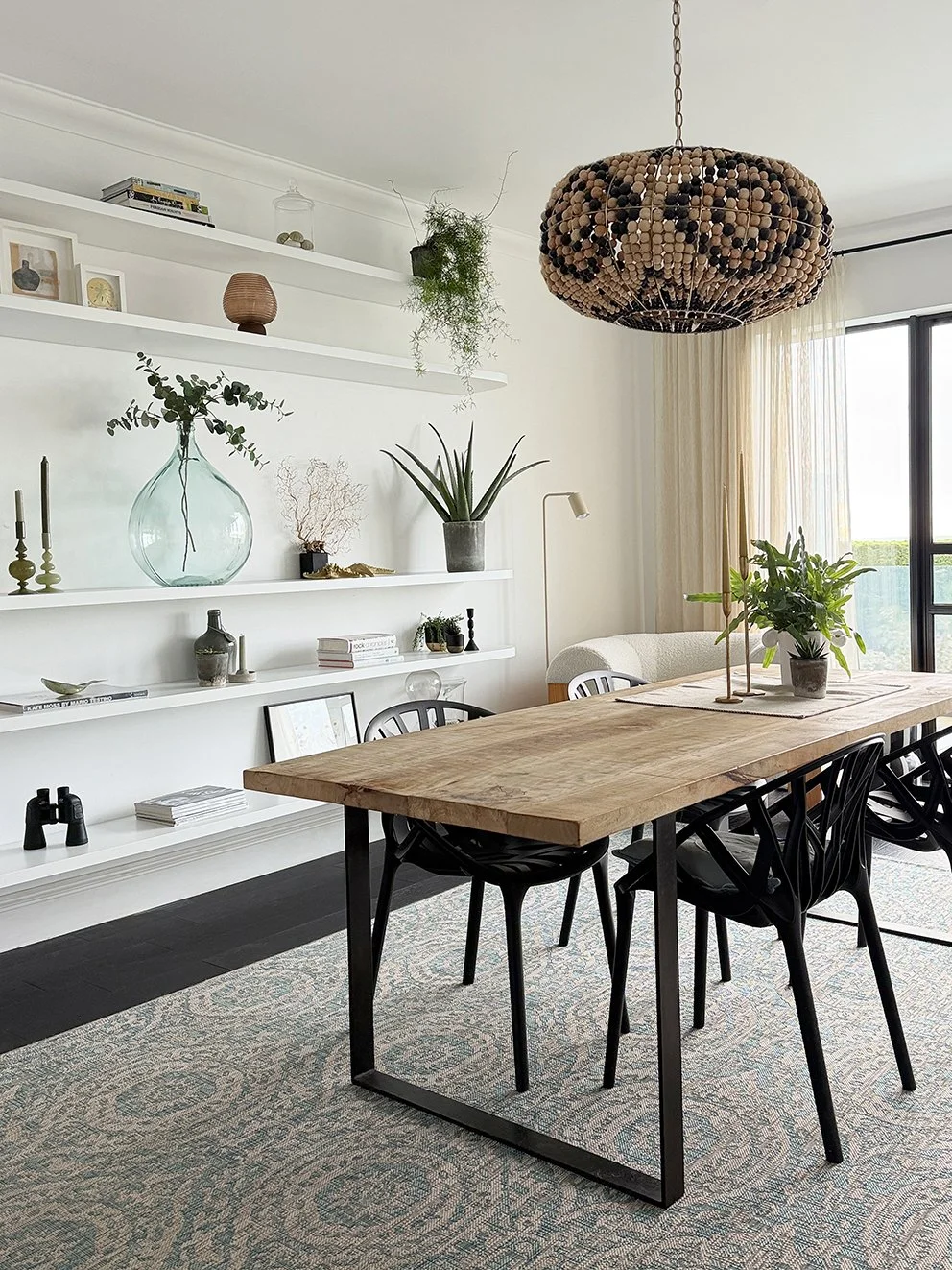
FINAL LOOK: New shelving installed
I had always wanted some form of shelving in the dining room and was hugely inspired by The Little Beach House in Malibu. Here, they have floor-to-ceiling white shelves which stretched to both edges of the wall, complete with vertical slats to make sections look like boxes - each one filled with a piece of artwork. At one point, I also considered using scaffolding shelves for a more rustic look, but with my table being rough mango wood, I didn’t want too much of the same texture in one room, which was also the case with the wood sideboard. This led me to eventually opt for white floating shelves.
I had used Ikea floating shelves before in a kitchen, but for this space I worked out that they needed to be three metres wide and chunkier, which meant having to be custom-made. Before committing, I waited until after London Design Week to soak up more inspiration. While in London, I visited the Soho Home store and spotted a display with beautifully curved white floating shelves. I knew instantly that this was exactly what I wanted. The assistant told me they were leftover display fixtures when Soho Home took over the premises. I took several photographs and then approached a bespoke shelving company to make the shelves and asked them to curve the edges. Apparently, this is quite straightforward, since most shelves are made from MDF. It took myself, my son and my brother-in-law all standing in a row to get them into place on long metal rods. A few hours’ work but it was worth it.
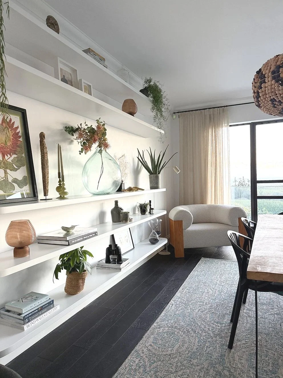
FINAL PHASE: New additions in place and styled
Here are my curved floating shelves alongside the dining table, with the addition of an accent chair, which I swapped with the black metal table. Last summer I was also refreshing the living room, which involved a new off-white sofa (I’ll reveal this in another post soon). When the delivery guys put the sofa in its place, it was one of those horrible moments when I thought I had made a huge mistake! Despite both pieces being off-white, they did not work in the room together. The bouclé chair made the sofa, in an off-white tone called ‘Sea Salt’, look pink! Luckily, the chair fitted perfectly in the dining room.
For what seemed like ages, I had temporary curtains hanging that I had actually remade myself, but once everything was in place, it was time to get the finishing touches right - and a new set of curtains. Throughout the process I realised two things. First, especially in rooms with high ceilings, your pole or rail should sit as high as possible. I raised mine right up beneath the cornice. Hanging curtains from the highest point not only adds vertical emphasis to the room, but also gives the curtains a more elegant, flowing appearance. Second, still having my temporary curtains hanging badly while the rest of the room looked finished made me realise how essential window treatments are and can make or break the look of a room. I will be going into much more detail in my future post on curtains.
Finally, I want to use my dining area as an example to touch on visual weight - which is how heavy or light a space feels. Getting the balance right in a room is key to harmony and you will feel far happier with it long term. My dining table, sideboard and black metal table were all large surfaces, and of a similar height, which drew the eye to one low level. While I was making use of them temporarily, I tried to add contrast, colour and scale to compensate for this by placing a mirror above the sideboard and tall plants to give height. It’s a similar principle to creating a vignette. Ideally, for it to look balanced you need one taller item, one middle and one lower. This is why removing the sideboard worked well as the new shelving created vertical height and structure which, along with the armchair, which was lower than the table, made the room feel far more balanced.
LET’S SUM UP
So, now you’ve seen my dining room refurb and restyling, you can see the various stages and what makes a difference, furniture-wise, as well as the window treatments. It also shows that you don’t have to do everything at once or buy new, and how, by living in the space for a while, allows you to have a better idea of what works and what doesn't. Look out for my kitchen and living room restyling and refurbs coming soon.