
WOW!house 2026
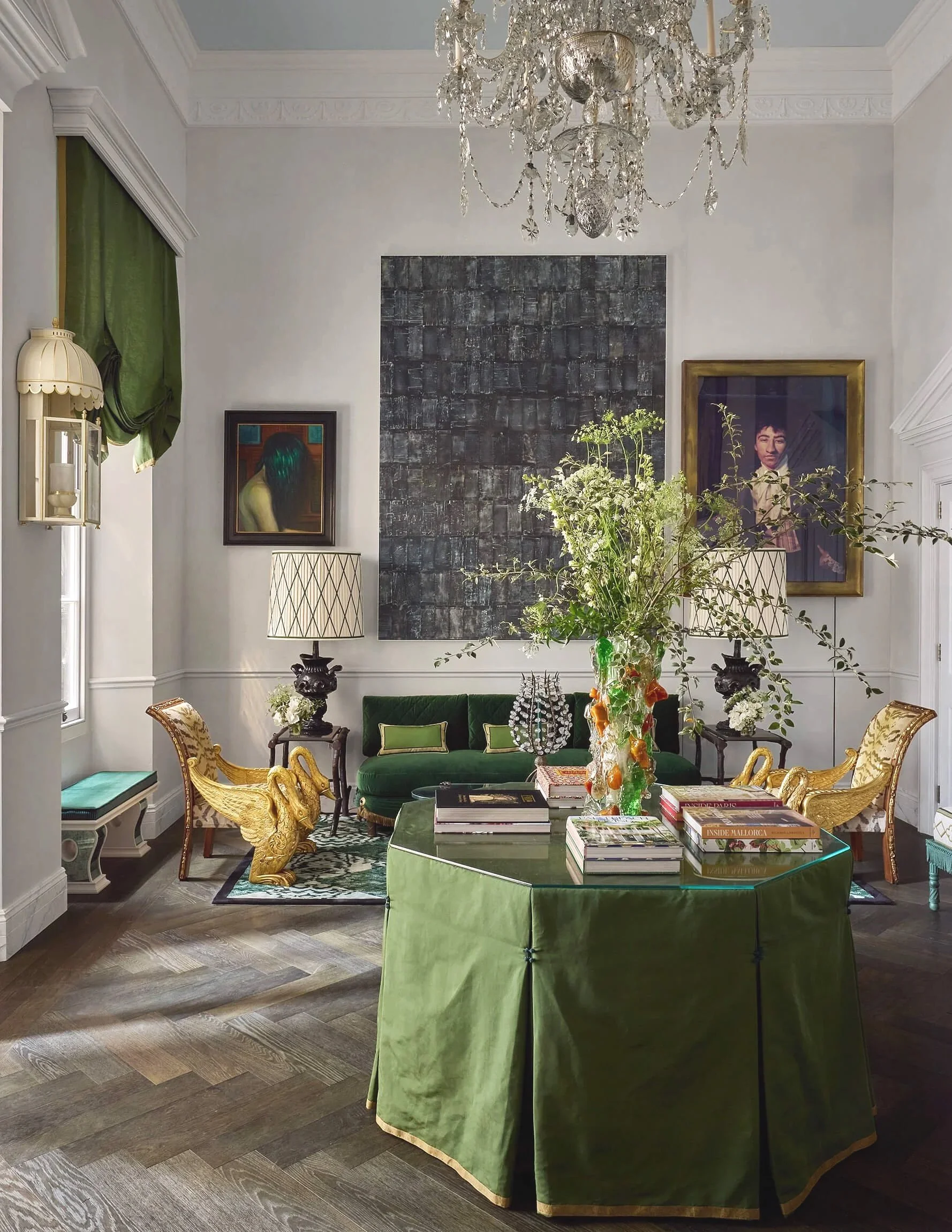
Photo credit: by James McDonald courtesy of Design Centre Chelsea Harbour
Like fashion, the interiors world launches new collections every spring and autumn, so summer can sometimes feel a bit flat. Thankfully, June brings us WOW!house - a month-long immersive showhouse packed with inspiration for interior lovers. This is not just a collection of room sets in showrooms; WOW!house is an entire 22-room house built from the ground up, spanning the full length of Design Avenue at the Design Centre, Chelsea Harbour.
Behind an impressive Georgian-inspired facade lies a series of spectacular rooms including a drawing room, parlour, library, dining room, kitchen, bedrooms, bathrooms, bars and outdoor spaces, created by world-class interior designers in collaboration with leading interior brands. As you enter each unique space, there are stunning focal points and standout features around every corner. Not only does every room have the wow factor, but the journey through the house is a sensory one too, with the fragrances from Jo Malone scented candles drifting from one room to another.
My visit to WOW!house
I was lucky enough to be invited to the press launch, making me one of the first people through the door. The grand Entrance Hall, pictured above, was designed by award-winning Francis Sultana and is the first room you encounter. It’s exquisite and one of my favourites due to its emerald-green tones, which create an indoor-outdoor feel, as well as luxurious materials that add a touch of glamour, and the beautiful mix of old and new.
The Entrance Hall
Using British stately homes and historic London mansions as a starting point, Francis Sultana created a space that celebrates both the history of interior design and his vision for its future. Antique pieces, like the 18th-century chandelier, sit comfortably alongside contemporary art, while the room also incorporates many elements that make a striking interior: rich, bold colour, metallic finishes in the form of an organically shaped piece of bronze, and natural materials including the chevron oak flooring. Like many of the rooms, the Entrance Hall has more than one standout feature, making it a real feast for the eyes whichever direction you turn.
Come and visit WOW!house
Now in its fifth year, WOW!house is open to the public from 2nd June to 2nd July. Read on for a tour of some of my favourite rooms, the interior design threads throughout the house and the styling ideas you can take away for your own home.
Photo credit: by James McDonald courtesy of Design Centre Chelsea Harbour
Before we set foot in the main house, we are greeted by a new addition to WOW!house - the enchanting Garden Folly Room designed by Studio Enass, which is a standalone building that sits before the main entrance. I had to show you this stunning space as it sets the tone for the entire house. Decorated in opulent jewel-like shades, and layered with texture and intricate detail, it feels luxurious yet welcoming. Tapping into her North African and Arab heritage, designer Enass Mahmoud has blended these influences with Mannerist and Rococo notes to create a tranquil yet indulgent oasis designed for joyful moments - a space perfect for afternoon tea or early evening cocktails.
Interior takeaways
Before we take a deep dive into the design behind each room and the style takeaways, here are the overall interior threads that run through the house.
COCOONING ROOMS
Fabric-wrapped spaces, wall-to-wall carpet, and rooms that feel embracing, comforting, and enveloping.
CURVES
Fluid shapes and curves appeared in many rooms, from sofas and kitchen cabinetry to the architecture itself, with designers using drapery to shape and soften hard lines.
EXTERIOR ROOMS
Outdoor spaces were given as much attention as indoor rooms with beautiful furniture, fabrics, and accessories.
QUIET DRAMA
Rich colours, tactile fabrics, and metallic elements resulted in elegant, luxurious, and opulent spaces, rather than anything overly flashy.
TECHNOLOGY
Alongside speakers discreetly hidden in books, there was smart lighting and screens integrated into bathrooms and ceilings to mimic natural scenes, taking WOW!house to a whole new level.
DECORATIVE CEILINGS
The ceilings were far from an afterthought and all had some form of detail, whether they were coffered, panelled, painted, or fabric-clad, drawing the eye up beyond the walls.
ARTISANAL FEATURES
A deep respect for craftsmanship runs throughout the rooms, with designers collaborating with artisans and specialist makers to create everything from hand-blocked fabrics and wallcoverings to bespoke joinery, decorative plasterwork, and hand-painted finishes.
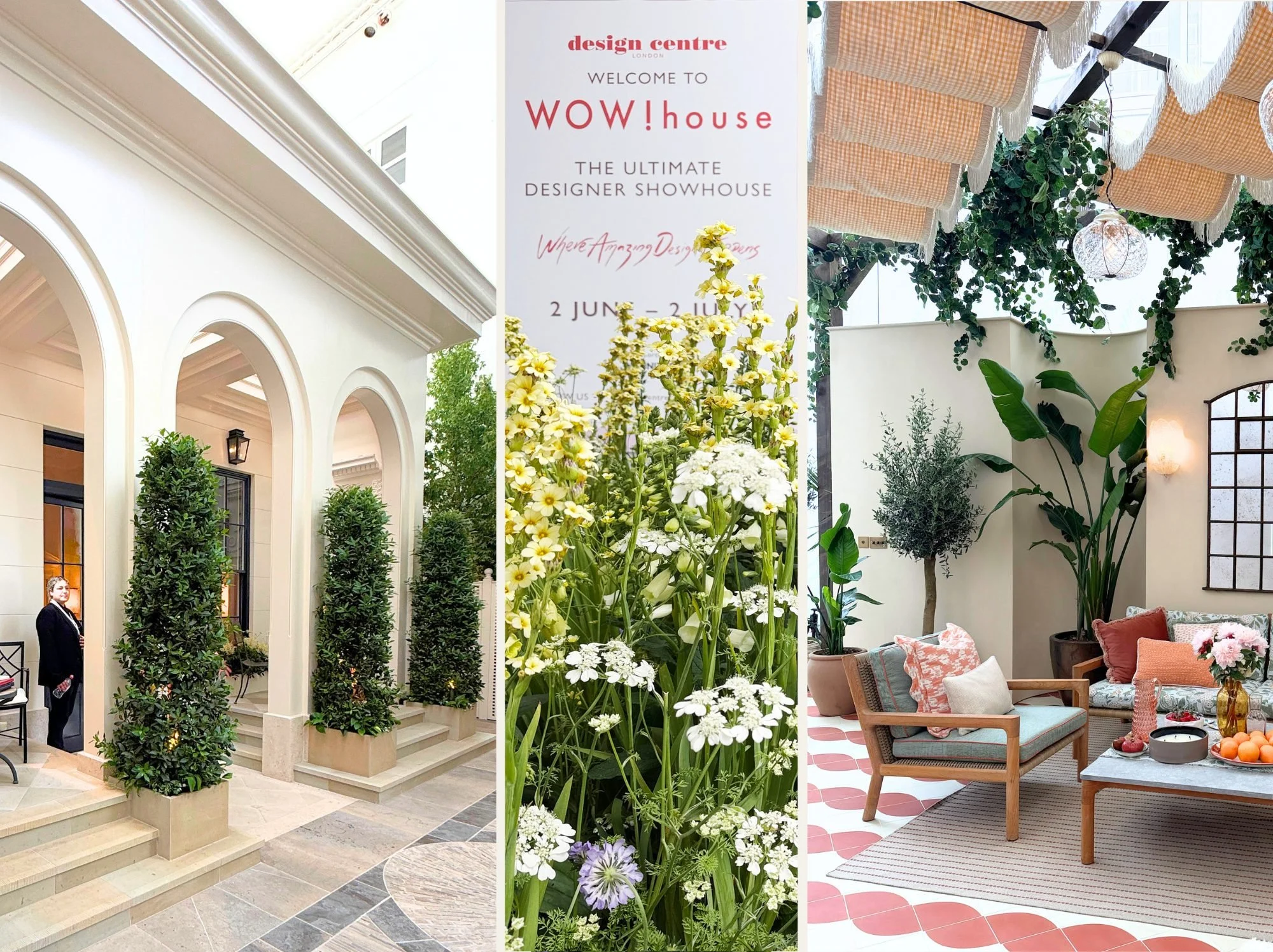
Photo credit: Sandra van Aalst
A grand arrival at WOW!house
Having visited the Folly, it was now time to head over to the house. The facade of WOW!house, pictured left, makes an imposing entrance and its poise and symmetry owe much to the architects who shaped Georgian London. With a covered loggia complete with seating, elevated platforms, built-in planters and dark-framed windows, it definitely creates a striking first impression.
Designed by Darren Price of Adam Architecture, who is part of a new generation of classical architects redefining tradition for contemporary living, the facade demonstrates how classical architecture can evolve while retaining its integrity.
The building is painted in Benjamin Moore’s ‘French Macaroon’, a colour that, much like the architecture itself, is a modern classic. In the image on the right is the stunning sun-kissed terrace that brings the journey through WOW!house to an end, a space I will visit later in this article.
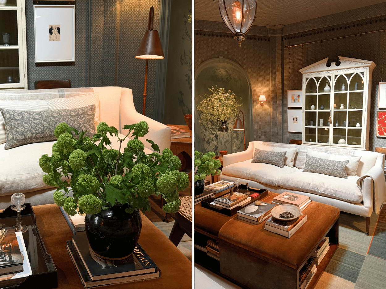
Photo credit: Sandra van Aalst
Blending old and new in the Turnell & Gigon Group Drawing Room designed by Albion Nord
This drawing room is all about the harmony of old and new. Design studio Albion Nord, known for its soulful, grounded spaces, collaborated with the Turnell & Gigon Group to create a room that showcases the beauty of craftsmanship.
The walls are wrapped in a hand-blocked linen wallcovering, while architectural details such as the recessed arches feature vases brimming with foliage. White linen sofas are styled with fashionably wide rectangular cushions in an intricate fabric that echoes the tones of the walls and rug. The seating area is anchored by a custom kilim rug created with Tim Page Carpets, while the velvet ottoman in warm earthy tones brings softness and warmth to the room and allows for a surface to display books and other treasures.
Styling takeaway: This ottoman is the perfect example of a beautifully styled surface. Books are stacked and topped with decorative objects, including a ceramic dish and black earthenware vase with flowers. The designers have also used a tray, which is ideal for styling an ottoman as it helps group books and other decorative accessories, while making the arrangement feel more considered.
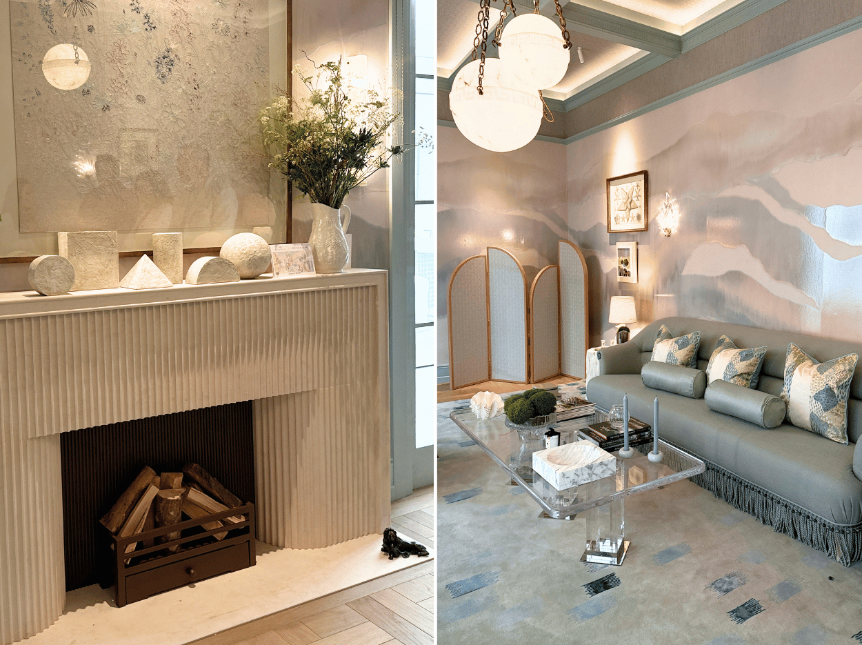
Photo credit: Sandra van Aalst
Quiet luxury in the Phillip Jeffries Morning Room designed by Sara Cosgrove
In the Morning Room, the ambience immediately feels calm and serene. With its luxurious textures and many shades of soft blue, it is the perfect example of how to take different tones from one colour and weave them through an entire scheme. Designed by Sara Cosgrove, the room is enveloped by Phillip Jeffries’ ‘Aura’ mural, with glazed waves creating depth, movement and interest across the walls. Bespoke upholstered seating, featuring a decorative trim, adds another layer of detail, while the soft blue tone enhances the tranquil feel of the room.
Styling takeaway. There are two key styling takeaways here. The first is to display a collection of similar objects in the same colourway to create impact, as seen on the mantel in the image above. Secondly, the coffee table is styled with blue candles that echo the tones of the room, while different shades of blue are reintroduced through the rug. These subtle touches may seem small, but they really help pull the whole look together.

Photo credit: Sandra van Aalst
Timeless Pattern and Colour in the Salvesen Graham Primary Bedroom
Pattern and colour come together beautifully as you step into this 18th-century country house-inspired bedroom, centred around an indulgent four-poster bed. The canopy, pelmet and curtains are dressed in intricate patterns, while the floral motif of ‘Constance’ wallpaper wraps all four walls and, with great attention to detail, is reintroduced on the bed linen. The bedding itself is luxurious crisp white cotton, layered with a patterned duvet in the same botanical print as the inner canopy. Designers Mary Graham and Nicole Salvesen, known for creating personal, timeless interiors, together with fabric and wallpaper from their own collection, have included reclaimed wooden flooring and antique pieces to bring character and authenticity to the space.
When you first enter the room you pass a large bookcase. Hidden within what appears to be a book cover, visible if you look hard enough in the image on the right, is a tiny smart speaker. It brings the room bang up to date and shows that traditional-style interiors and technology can work well together, as it is so discreet that it doesn’t compromise the look of the room.
Styling takeaway: You can echo a tone in your bedroom with your bed linen or soft furnishings, such as accent cushions and throws. They don’t have to match exactly, but choosing similar tones can help create a cohesive look. Another idea we can steal from this room is displaying paintings and artwork attached to the shelving and positioned in front of the books, as shown in the image here. This adds interest, creates layers and breaks up the monotony of rows of books.
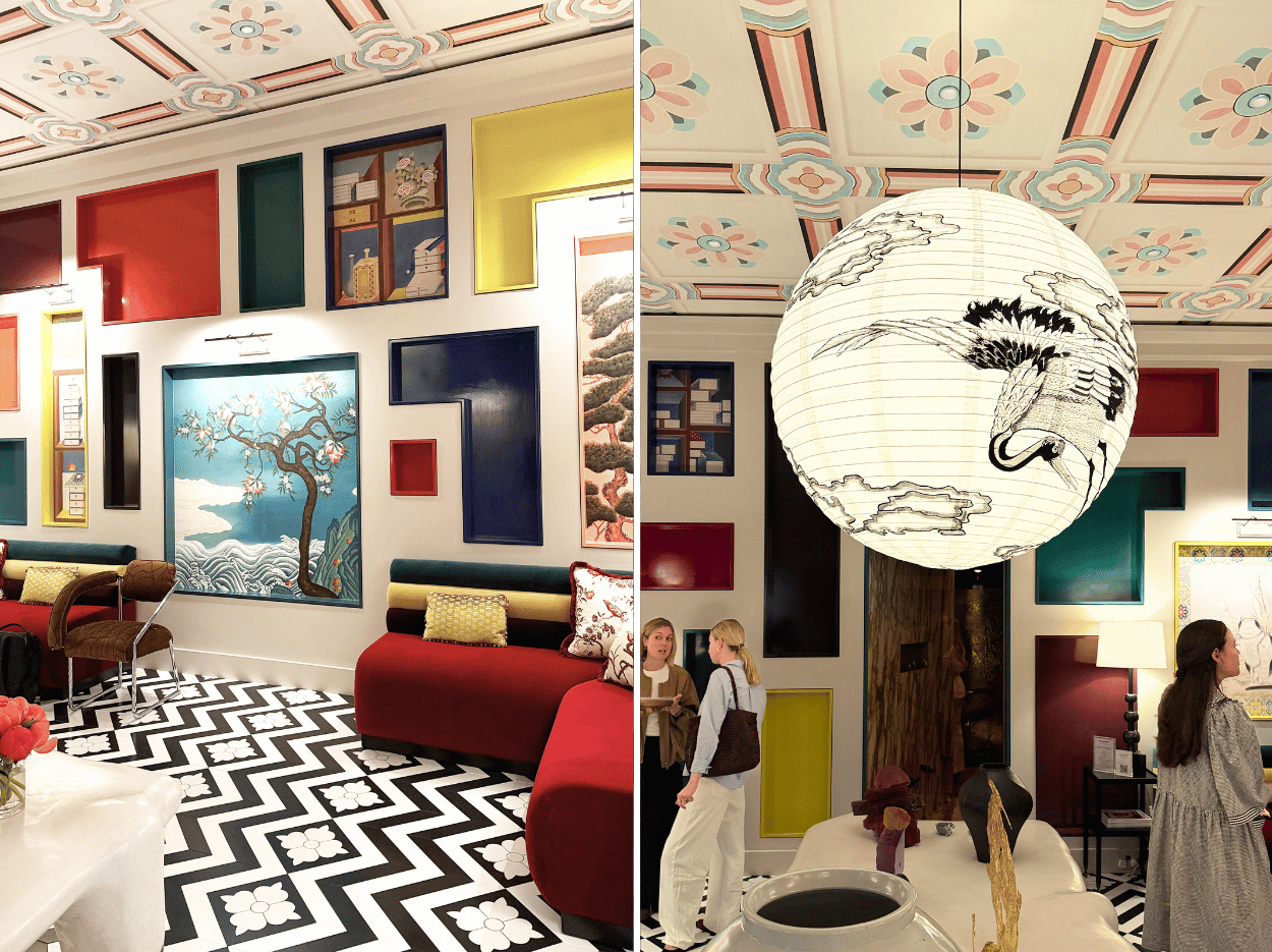
Photo credit: Sandra van Aalst
Maximalist colour in the Benjamin Moore Minhwa Salon by Young Huh
If you are a fan of bold colour and culture, this room is for you. As most of my house is adorned in Benjamin Moore paint, I was excited to enter the Minhwa salon where lacquered walls are inset with no fewer than 55 painted panels. Some are painted in vibrant high-gloss shades, including ‘Citron’ and ‘Jade Garden’, while others feature intricate artwork inspired by Korean folk art.
New York-based designer Young Huh draws on her Korean heritage and also takes her inspiration from the Millions Room at Schönbrunn Palace in Vienna, interpreting minhwa, a form of Korean folk art, in her own distinctive way. Alongside the detailed painted ceiling and bold monochrome tiled floor, what immediately catches your eye are the two multicoloured banquettes, whose vivid tones add to the room’s maximalist feel.
Above a gallery-style table, beautifully styled with decorative vessels, hangs an oversized paper pendant that has also been painted with a decorative design. This is another creative idea to take home and adapt for your own interiors.
Styling takeaway: Don’t be afraid of colour. You don’t need to paint a whole wall to make an impact. Colour can be introduced through artwork, furniture, home décor, and soft furnishings.
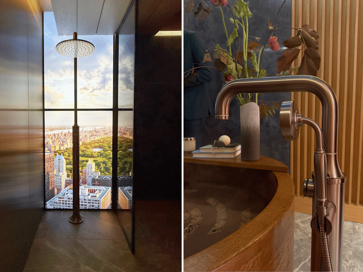
Photo credit: Sandra van Aalst
A multi-sensory experience in the Samuel Heath Primary Bathroom by Rigby & Rigby
As you wander into the bathroom, the feeling is immediately Zen, with design influences that are distinctly Japandi, a blend of Scandinavian and Japanese influences. Before you even begin to explore the rest of the bathroom, your attention is drawn to the shower and the scene beyond what appears to be the window, transporting you to another part of the world. Here, you can take a shower overlooking Central Park or in a tropical landscape with Bird of Paradise leaves swaying gently in the breeze, with each scene accompanied by its own immersive soundscape.
Designed by studio Rigby & Rigby to showcase Samuel Heath’s stunning bathroom fittings and hardware, the creative director of Rigby & Rigby, Jason Stewart, explained to me that the video footage features locations where the company has studios around the world.
The next surprise was the gentle mist and scent of cedarwood drifting out of a round wooden Japanese soaking tub, complete with a striking floor-mounted single-lever bath mixer in anthracite and brushed nickel, pictured right. Set against plaster walls and vertical wood cladding, the overall look is that of a luxurious wellness retreat. It really feels like a place to linger, relax and awaken all the senses.
Styling takeaway: If you are considering purchasing taps, showers, bath mixers or any other bathroom hardware, there are so many finishes to choose from. While chrome is making a comeback, I still think that warmer finishes like brushed nickel, antique brass, and bronze look far more stylish, especially in a bathroom setting with natural materials such as wood and stone. My bet is that they are here to stay, just like Crittall-style windows, bouclé, and curves!
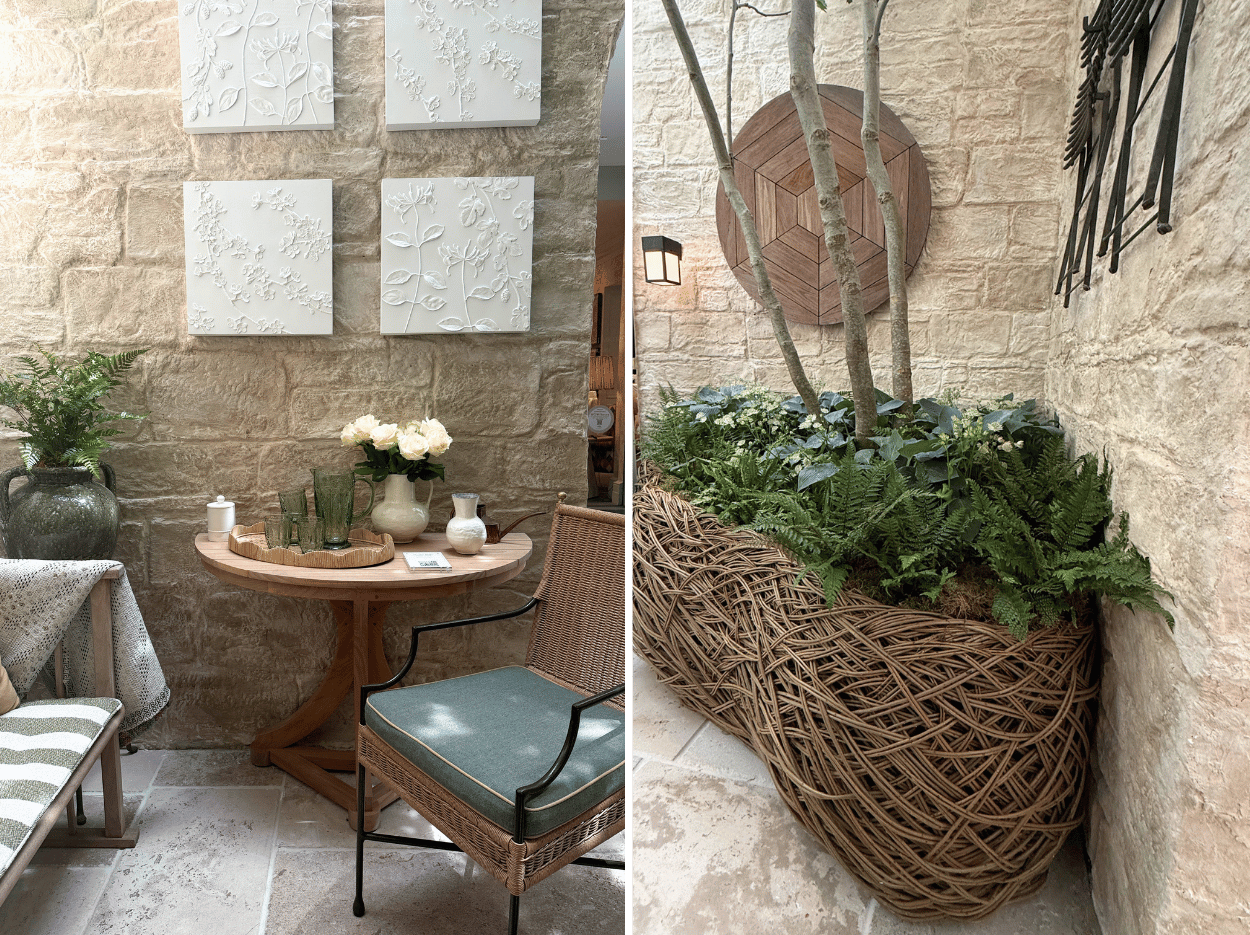
Photo credit: Sandra van Aalst
Relaxed outdoor living in the Munder Skiles Courtyard by Richard Miers
It was a surprise to step outside to an outdoor courtyard that felt every bit as stylish as the WOW!house interiors. Three London plane trees in vast sculptural willow planters make a real statement, with the mature trees towering almost as high as the Design Centre itself.
Garden designer Richard Miers explained that the concept centres around a timeless stone courtyard where past and present exist in quiet harmony. The well-worn limestone floor suggests generations of use, giving the terrace an established feel.
The seating area, featuring a natural teak bench and sinuous metal lounge chairs from Munder Skiles, was integral to the design of the courtyard, helping it feel as much a room as a garden. The materials are entirely natural, from the limestone flooring and planting to the willow seating and wooden furniture. The colour palette centres around soft greens, repeated in different tones on the seat cushions, throws and glazed urn, all echoing the surrounding foliage and trees.
Styling takeaway: A side table outdoors gives you a surface to style decorative items as well as a practical spot to place drinks and accessories, like the tray with the jug and glasses shown on the table in the image here. If your seating area is positioned close to a wall, you can also make it feel more like an indoor room by introducing wall art, like the three-dimensional botanical plaster pieces featured in this space.
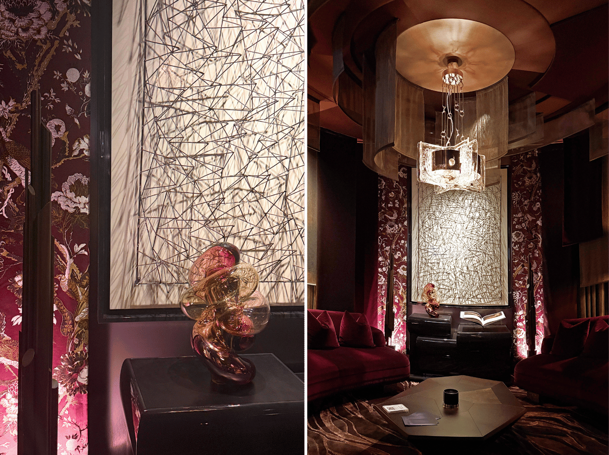
Photo credit: Sandra van Aalst
The circle of intrigue in The Parlour by Martin Kemp Design
I entered The Parlour with intrigue. It is a room designed to entice before it reveals itself. Softly illuminated to create atmosphere, shadow and depth, it gradually unfolds as your eye moves around the space. First, you notice the stunning central pendant light composed of individual semi-translucent panels, then you are wowed by an impressive three-dimensional wire art installation pictured here, subtly backlit to stand out against the darker elements of the room.
I was greeted by Martin Kemp himself and soon realised that this unique space offered a rare opportunity to glimpse his work, which until now has remained largely private despite being the sort of interior that could easily grace the pages of the likes of AD and The World of Interiors. With its cascading suspended panels of drapery curved to create softness, depth and movement, the cocooning room is, as Kemp describes it, “circular in plan and layered in form, with comforts discovered slowly.”
Furnished with a pair of curving ‘LaBrea’ sofas from Kemp’s new furniture brand Avenue, making its debut at WOW!house, the room features many other pieces created by him, including low asymmetric chairs upholstered with botanical blooms, alongside carefully chosen vintage finds. Overall, it’s luxurious, rich in colour and filled with tactile pieces you want to touch. As Kemp eloquently puts it: “Luxury isn’t declared. It is felt.”
Style takeaways: This room, like many others at WOW!house, began as a rectangular shell, yet there is hardly a straight line in sight. Curves have been used throughout to create a softer, more fluid aesthetic. Organic shapes are now appearing in everything from chairs and sofas to coffee tables and lighting. Even something as simple as a fluid-shaped vase can help soften hard lines and bring a curvaceous element into your interior.
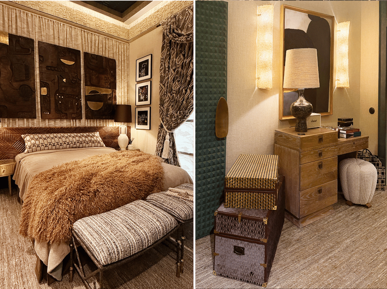
Photo credit: Sandra van Aalst
Texture in the Misia for Casamance Group Bedroom Suite designed by Henri Fitzwilliam-Lay
When you walk into this bedroom, there’s a feeling of being transported elsewhere. Rich in references to different places and periods, it could be the bedroom of a well-travelled collector. Texture features everywhere you look, from the fabrics, curtains, and wallcoverings to the furniture, carpet and accessories. Nothing is left flat or plain. Even the suitcases display lively patterns.
Designer and former fashion stylist Henri Fitzwilliam-Lay has looked in part to the Art Deco era for inspiration but has reinterpreted it rather than recreated it. Above the bed, the wall-mounted hand-carved headboard showcases detailed ebonised wood treatments that are from this period. Deco influences can also be seen in the metallic bedside tables and door handles. However, the room extends beyond this design movement. As Henri explains: “We’ve opted to try and create sort of a time capsule, somewhere that feels like it is the result of travel through different destinations and places. We wanted the room to feel layered and collected, slightly nostalgic yet simultaneously forward-looking.”
With French fabric and wallcovering brand Misia, part of the Casamance Group, as her room sponsor, the textiles play a significant role in the scheme. The curtains, pictured left, add a rich tactile quality to the room and are made from Misia’s ‘Riviera du Levant’ fabric, which, with its geometric repeat, has a subtle Jazz Age feel.
Style takeaways: To achieve a rich, globally-inspired interior like this room, layering textural materials is key. Introduce vintage finds or artefacts collected from your own travels and combine natural materials, woven textures and patterned fabrics to create that tactile layered look.
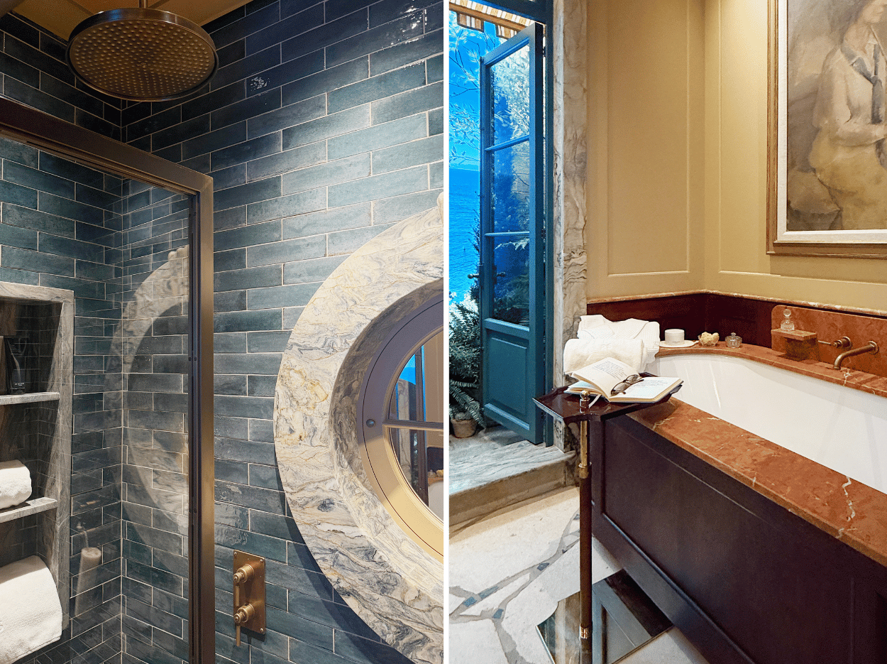
Photo credit: Sandra van Aalst
The spirit of summer in the Ca' Pietra bathroom by De Rosee Sa
Stepping into this bathroom, you are transported to a timeless hotel on the Mediterranean coast, with French doors opening onto gardens and views of the sea beyond. Rich in luxurious materials from stone and tile specialists Ca' Pietra and finished with exquisite attention to detail, this is a bathroom that elevates everyday rituals. Far from being a place to clean your teeth or take a quick shower, it feels like somewhere you want to linger, perhaps reading a novel in the deep bath enveloped in warm rose-tinted marble.
This is the mood that the husband-and-wife team of design studio De Rosee Sa set out to create. They have used the project as an opportunity to push the boundaries of what can be achieved in a bathroom through a considered use of materials and detailed architectural elements, such as the round window surround within the shower shown in the image on the left.
Decorative touches, including artwork, make it feel much more like another room in the house rather than a purely functional bathroom. The colour palette is drawn from the warm southern European earth, evoking sun-drenched days and perfectly capturing the spirit of summer.
Styling takeaways: Treat your bathroom like any other room in your home that you would happily spend time in. Choose beautiful light fittings, add artwork and, if space allows, include a chair. Another practical yet stylish addition is a small side table, like the one pictured here, giving you somewhere to place your book, drink or candle and encouraging you to spend more time enjoying a relaxing soak.
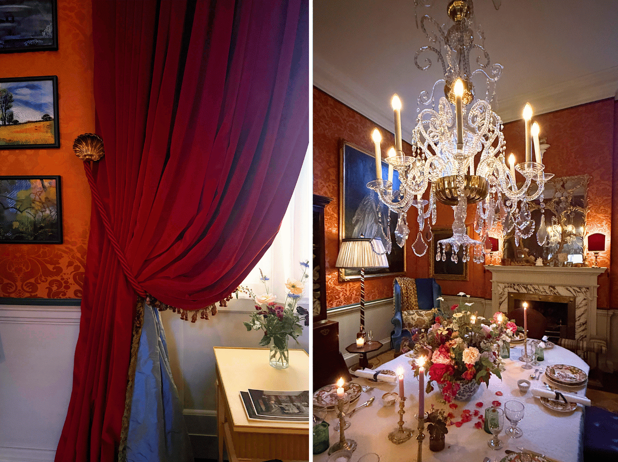
Photo credit: Sandra van Aalst
Proper drama in the Schumacher Dining Room by Max Rollitt
Having visited living rooms, bedrooms and bathrooms, I was delighted to find myself in a dining room. But this was no ordinary dining room. Designed by interior designer, furniture maker and antiques dealer Max Rollitt, the space has been reimagined as an 18th-century room in the late afternoon, with the table beautifully laid and candles flickering, ready for 12 lucky guests.
Rollitt’s aim was to infuse this reference-rich room with warmth and joy while ensuring it still felt relevant for modern living. He also achieves what he calls “proper drama”, with a spectacular chandelier taking centre stage. Lush silks and a luxurious terracotta damask wallcovering create warmth and provide a backdrop for the many gilt-framed artworks that adorn the walls.
The tablescape includes fine bone china, a vase overflowing with seasonal blooms and delicate candle holders, all arranged on a wool tablecloth. Another standout feature is the Schumacher fabric, transformed into rich, textured curtains with all the lining, trimming and fullness one would expect from the drapery of a stately home.
Styling takeaway: Whether you have a period home or a more contemporary abode, there is nothing quite like a beautiful traditional chandelier hanging from the ceiling. You don’t have to place it in a dining room, somewhere unexpected can create even more of an impact.
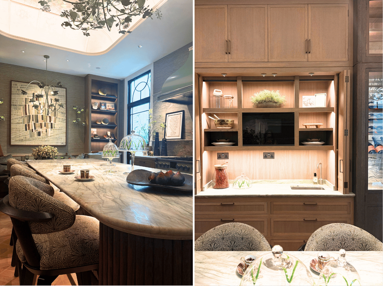
Photo credit: Sandra van Aalst
A kitchen rooted in the poetry of nature by Martin Moore with Samantha Bartlett
This was a room rich with so many beautiful elements that it instantly gives you inspiration for your own kitchen refresh, from the curved island to the stunning veined stone worktop. Designed as a space where memories are made and time is spent from morning coffee through to evening supper, interior designer Samantha Bartlett describes it as “a room rooted in the poetry of nature.” That influence is apparent in the palette of muted greens, botanical motifs, the sculptural ‘Ivy Shadow’ chandelier, and the beautifully veined green-toned quartzite. The materials have been chosen not only for their visual appeal and durability, but also for the patina they will develop and the way they will gracefully evolve over time, adding to the room’s timeless appeal.
The cabinetry combines grained fumed oak teamed with tactile bronze handles in a quietly glamorous way. Fluid lines soften the rectangular space, introduced through the banquette seating, curved island and bar stools. Despite its generous size, the room is welcoming and thoughtfully planned with plenty of space to prepare food, gather to enjoy a drink or sit down for dinner. Appliances are beautifully integrated, while shelving and cabinetry are illuminated to highlight the gorgeous décor pieces on display, creating a kitchen that feels as much a living space as a place to cook.
Styling takeaway: Display fruit in decorative dishes, like the ceramic bowl featured on the island here. Add meaningful artwork, particularly pieces that relate to food, entertaining or family life, like the framed wording in this kitchen that celebrates it being the heart of the home. Decorative accessories, like the elegant glass cake stands pictured here, can help make a utilitarian room feel more like a living space.
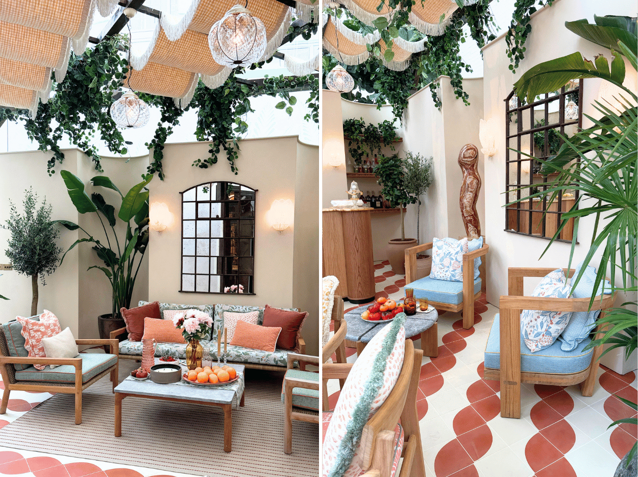
Photo credit: Sandra van Aalst
A sun-soaked afternoon at the Perennials and Sutherland Garden Terrace by Fettle Design
From the final interior room in the house, I spotted a terrace that instantly transported me to somewhere along the Amalfi Coast. As terracotta is one of my favourite colours, I was drawn to the twisting encaustic cement tiles and the warm terracotta tones running through the Perennials fabric on the accent cushions.
Inspired by Perennials’ latest fabric collection, La Dolce Vita, the designers created a romantic Italian-style terrace that captures the feeling of relaxed Mediterranean living. Featuring Sutherland’s beautiful outdoor furniture, the terrace is enclosed by clay plaster walls. Far from straight and plain, they are inset with curved architectural niches that frame towering Bird of Paradise plants and a life-size sculpture.
What is equally impressive is what happens above the terrace. Rippling across the space are lengths of La Dolce Vita fabric interspersed with pendant lights, adding shade, softness and movement. It actually gave me the idea to weave fabric across some form of garden structure, whether that’s an arbour, pergola or even a few tension wires.
Styling takeaway: To transform your outdoor seating space into an outdoor room, choose beautiful outdoor cushions in different patterns, sizes and styles. A coffee table also creates that indoor-outdoor feel and gives you a surface to style, as in the image with candles, bowls of fruit and vases filled with flowers.
LET’S SUM UP
I hope you enjoyed coming along on the tour of WOW!house. If you would like to visit, tickets start at £15: click here for more information and to book your tickets. Plus, every visitor will receive a copy of the WOW!wonderbook – a keepsake guide featuring interviews with the designers involved, as well as details of all the products used to create each room.
If you would like to read more interior industry articles like this one, you might like to head over to my article London Design Week Spring 2026: My Styling and Design Takeaways
For styling tips, you might like to check out the following articles:
Home Decor Essentials to Style Your Home and Make a Room Feel Finished
Stylish interiors to elevate your home: from curves and metallic finishes, to lighting and foliage


I'm Sandra, an interior stylist, writer, photographer and Sunday Times bestselling author. Having worked freelance for many of the interior magazines including Elle Decoration and House Beautiful, in my blog posts I share inspiring home tours, practical styling ideas and decorating tips to help you create a home that feels beautiful, personal and pulled together.
I also take you on tours of beautifully styled homes from around the world, offering inspiration and styling ideas to steal for your own space. Ultimately, I’ll show you how a little bit of styling can be transformational and take your home to a whole new level.