Merlot & Burgundy Interiors: The Rich Red Shades to Decorate with This Autumn
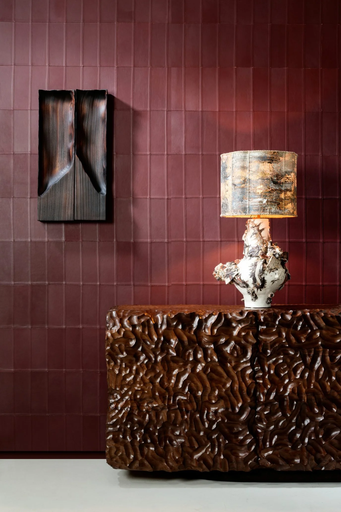
Photo credit: Arte
From merlot and burgundy to other berry- and wine-inspired hues, rich red tones are ideal for bringing colour and warmth into the home. They are emerging as one of the key looks this autumn, with warmer, deeper reds appearing across both fashion and interiors.
It’s a colour direction that’s been building over the last couple of years, as interiors have moved towards earthier, more natural and warmer notes. As a result, the red palette has become deeper, with warmer undertones and hints of brown. Paint brands have reflected this shift too, with Graham & Brown choosing Divine Damson as their colour of 2026, Little Greene predicting a move towards burgundy, and Sherwin-Williams naming burgundy as its colour of the month for August.
Merlot, burgundy, oxblood and other wine- and berry-inspired reds are often easier to live with than primary bright reds. These shades feel warm, cocooning and inviting, adding depth and character to a room without necessarily feeling overly bold, and work in all property styles, from modern kitchens to heritage-style drawing rooms. Pictured here is the Paladin wallcovering by Arte, in a shade called Nightfall featuring satin-finished leather cut and stitched by hand into a clean, linear pattern.
You can use these richly toned reds in so many different ways, from colour drenching and enlivening a drab room to introducing them through accent furniture, kitchen cabinetry or more subtle pieces such as side tables, artwork or even simply a bunch of deep red flowers.
In this article, I’m going to look at some of the most frequently asked questions about decorating with rich red shades and share some of the best deep red paints from leading brands. I will also explore where to use these colours and the materials, textures and hues that pair beautifully with them.
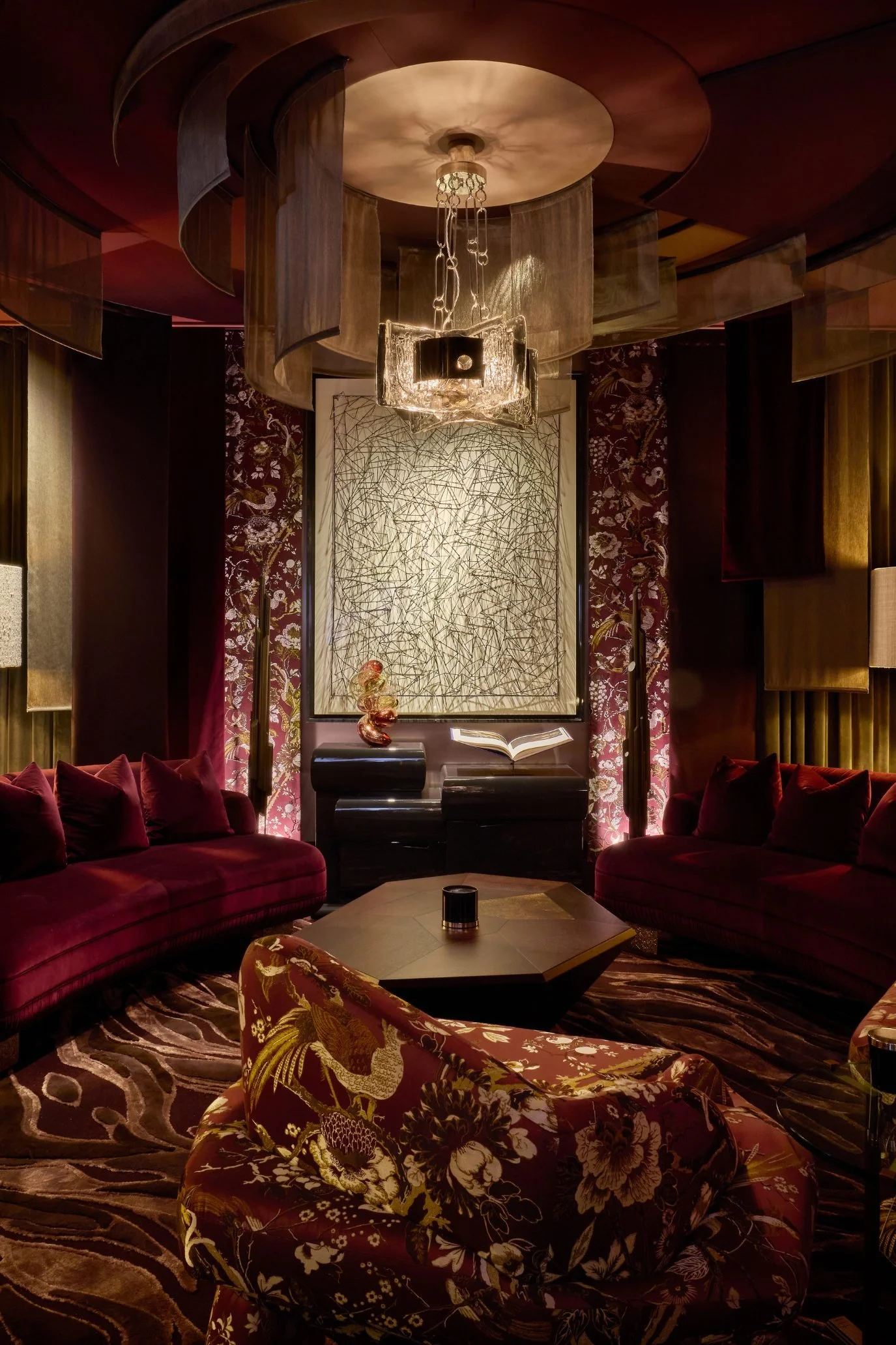
Photo credit: by James McDonald courtesy of Design Centre Chelsea Harbour
The world’s top interior designers are showcasing these enduring shades of deep red, using them to evoke a luxurious look and creating rooms that feel considered and intentional. I witnessed this transformative effect for myself in The Parlour, at WOW!house press day this June.
WOW!house is an entire 22-room house created by world-class interior designers in collaboration with leading interior brands. Several rooms incorporated rich red tones into their schemes, but The Parlour by Martin Kemp Design used a layered mix of deep red shades to particularly stunning effect. Softly illuminated to create atmosphere and depth, the room felt opulent and cocooning, with metallic elements adding drama. The contrast in texture stops the scheme from feeling flat and instead gives it a rich, embracing quality.
You can take a tour of WOW!house and visit several of the rooms in my full feature WOW!house 2026.
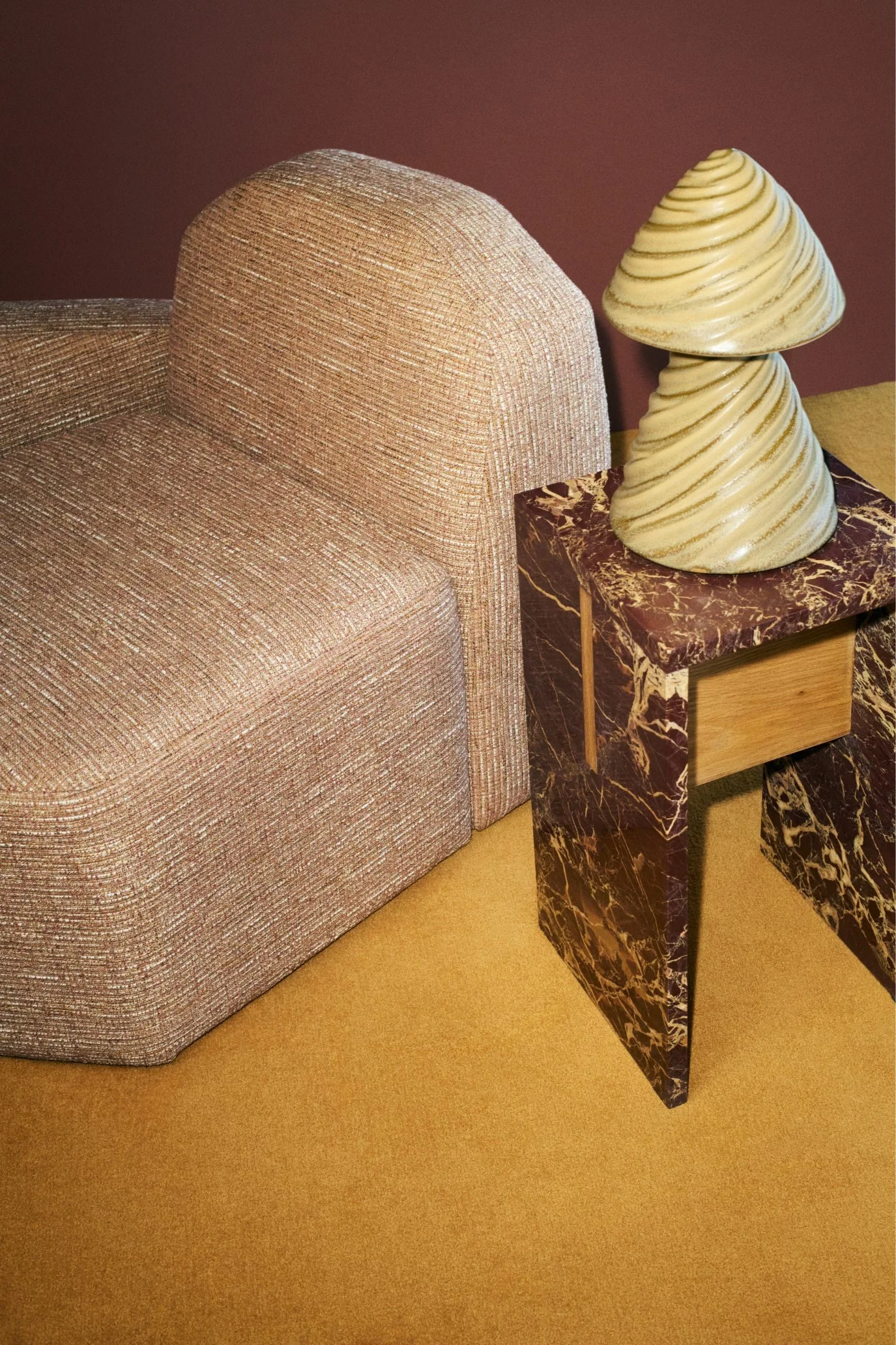
Photo credit: Sean Thomas/ H&M HOME
So, are all rich reds popular, or is one particular shade leading the trend? Merlot is certainly having a moment, as is burgundy, but many other deep red wine- and berry-inspired shades are proving popular too. These colours lend themselves beautifully to accent pieces and furniture, as seen in the burgundy and beige marble SOLN side table pictured above, designed by world-renowned interior designer Kelly Wearstler in collaboration with H&M HOME. If you would like to see the rest of the collection, do head over to my feature Kelly Wearstler x H&M HOME: Inside the New 29-Piece Collection
FAQ’s on using merlot, burgundy and other rich wine-toned or berry reds
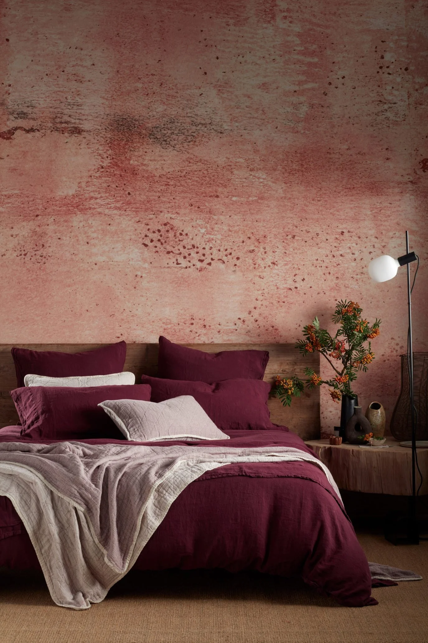
Photo credit: The Secret Linen Store
Can I colour drench a room in a deep red tone? These hues work particularly well for colour drenching, especially in a smaller room such as a study, powder room or snug, where they can create a cocooning, warm feel. Colour drenching means taking the same colour across the walls, skirtings, radiators, cornices and woodwork and, if you want to take it even further, the ceiling too.
Can I use deep red in a north-facing room? Yes, you can, but as a north-facing room tends to have cooler light, choose a deep red with brown-based undertones, rather than one with cooler undertones, such as purple or blue.
How should I light a deep red room? Ensure you have good ambient lighting with warm-toned bulbs, which will enhance the richness and prevent the colour from looking dull. Mirrors can also help reflect light and bounce it around the room.
What colours go with deep red? Deep red tones pair beautifully with warm off-whites and neutrals, as well as more earthy shades such as olive green, terracotta and chocolate brown. They also work well with muted blues, soft greys and dusty pinks.
Could these deep red tones make a room look smaller? Dark colours can work well in a small room, creating atmosphere. Although they won’t necessarily make it look larger, neither do they automatically make it feel smaller. To create balance, pair with lighter coloured furniture, artwork and accessories.
What materials work best with deep reds? Brass, bronze, dark wood, such as walnut or burl wood, and natural stone also complement these rich reds really well, as do tactile materials such as velvet, linen, wool, marble and handmade ceramics. The beetroot linen here is by The Secret Linen Store and is a way to bring these shades into your home in a softer, less permanent way.
Where to introduce rich reds into your home
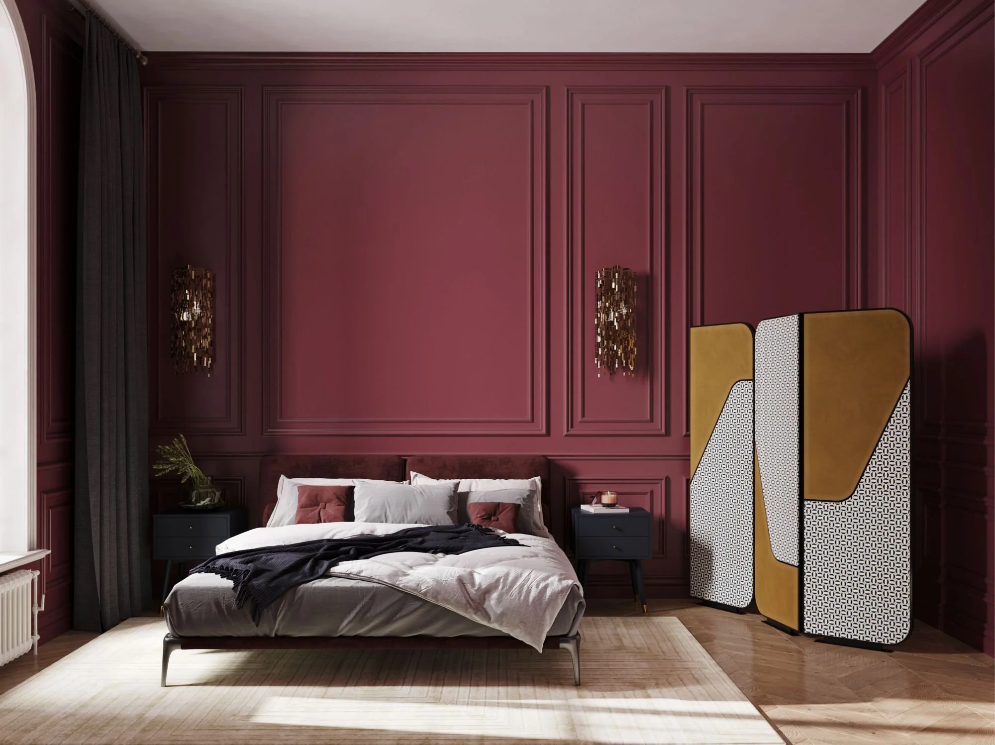
Photo credit: Caffe Latte
Having looked at the last few gorgeous, richly coloured interiors, including the bedroom above by Caffe Latte where different tones have been used across the wall panelling, headboard and cushions, you may now be convinced that you want to bring these wine- and berry-toned shades into your own home. Before we look at each element in detail, here is a quick list to glance over.
Walls: From full colour drenching to an accent wall or a colour-block wall at dado height, these shades can work beautifully in different rooms from a living room to a small powder room. Pair them with light neutrals and natural wood to balance the darker tones.
Cabinets and shelving: Kitchen cabinetry and shelving can look particularly striking in a saturated deep red, especially when teamed with lighter worktops, walls and metallic finishes.
Furniture: Sofas, accent chairs, ottomans and headboards, like the one pictured here, work beautifully in these shades. Rich, tactile fabrics, such as velvet and linen, add even more depth and will make the piece a real focal point in the room.
Soft furnishings: Cushions, throws and tie-backs can have more impact than you think and are an easy way to try the colour without committing to something more permanent.
Rugs: A rug can bring in a generous amount of colour without feeling overpowering because it sits lower in the room. Patterned designs work well mixed with other softer shades such as blush pink, muted neutrals or faded teal.
Accessories: Vases, candlesticks, trays, books, flowers and ceramics can all introduce smaller touches of the colour and help repeat the shade throughout a space.
Lighting: Lamps, whether through the bases or lampshades, as well as pendant lights, can either blended into a wider colour scheme or as a bold statement.
Artwork: From an oversized canvas in the living room to a small print propped up on a kitchen shelf, art is a great way to bring these rich tones into your interior.
The paint colours
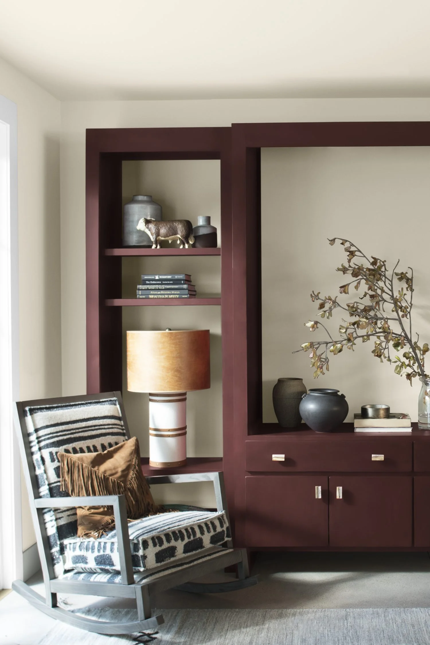
Photo credit: Benjamin Moore
As we approach the end of 2026, paint brands will soon start announcing their new colours for 2027, and before long, these shades will start filtering through from the catwalks and interior showrooms to the high-street and online stores. Dulux Australia has already included Murray Red in its 2027 Colour Forecast, reinforcing the mood towards richer, deep reds.
Pictured here is an entire wall unit with cabinets painted in Benjamin Moore’s New London Burgundy. If you are thinking about painting your walls, doors, shelving or cabinetry, paint brands offer a whole variety of deep red shades. Here are some of my favourites:
Benjamin Moore - Bordeaux Red, Classic Burgundy, New London Burgundy
Farrow & Ball - Preference Red, Eating Room Red
Sherwin-Williams - Merlot, Burgundy
Earthborn - Lady Bug
Paint & Paper Library - Grenache
Little Greene - Arras, Baked Cherry
Graham & Brown - Divine Damson
Accent furniture for rich red focal points
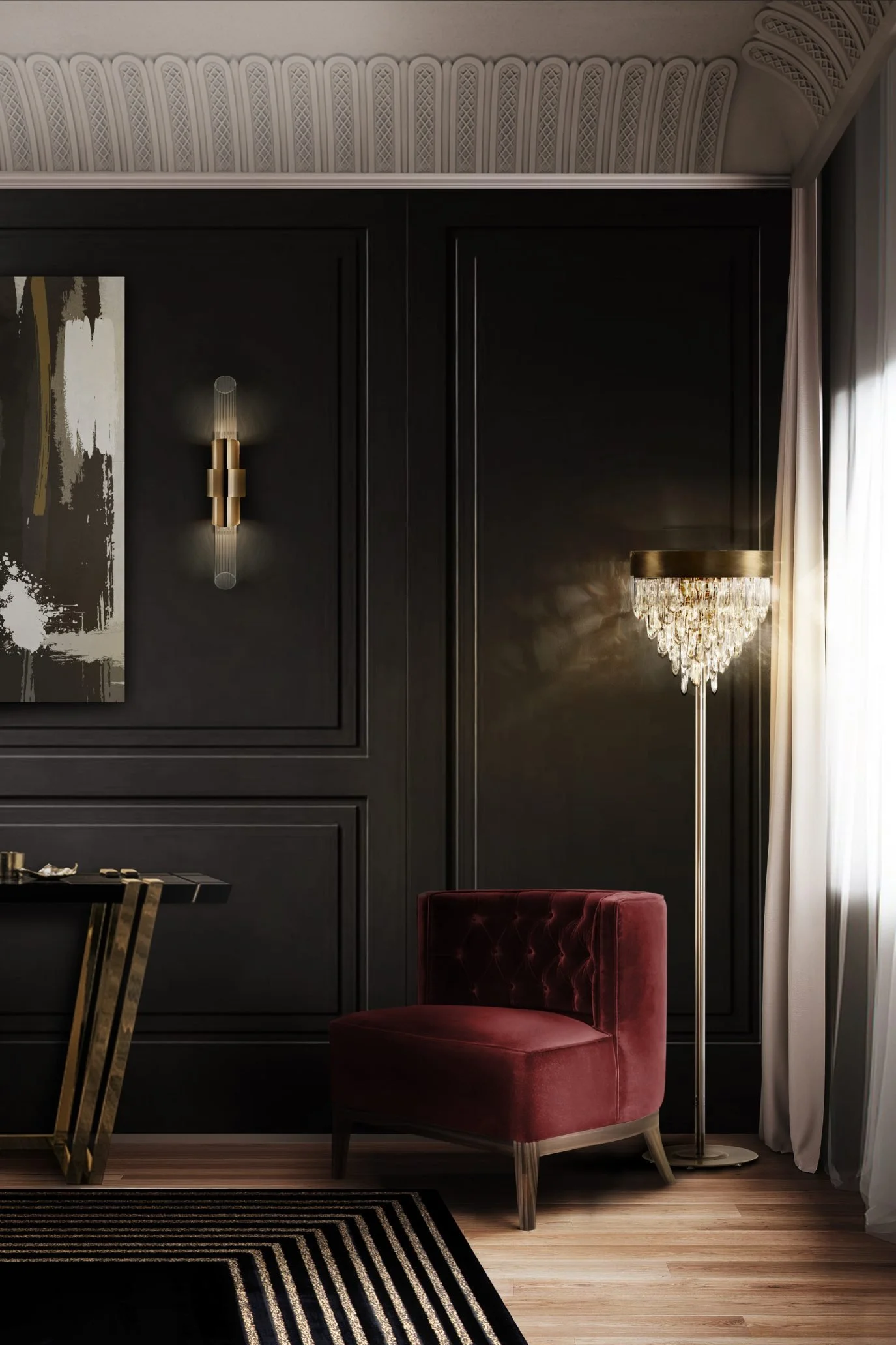
Photo credit: Covet House
Furniture such as an accent chair or sofa is an ideal way to introduce rich red to your interior. Rich, tactile fabrics like velvet and linen work particularly well as they add depth and texture, preventing the piece from looking flat while also bringing a luxurious feel to the room.
I like the way that the Bourbon Armchair by Covet House is set against a deep brown wall with metallic accents for a really sophisticated look. Named after the House of Bourbon, the French dynasty associated with grandeur and luxury, the chair reflects this opulence through its tufted back and sumptuous deep red velvet upholstery. A sofa ottoman would also work well when paired with warm browns, dark wood and jewel-toned accents.
Artwork in wine-toned and berry shades
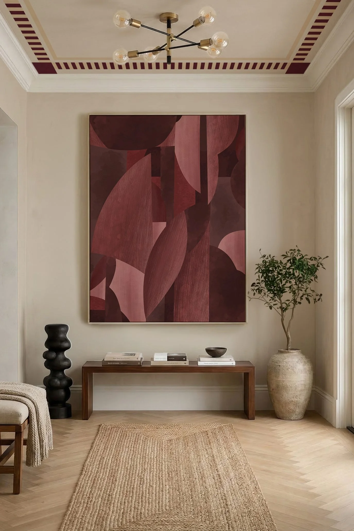
Photo credit: Photowall
Artwork like this oversized contemporary piece is an effective way to introduce deep reds into your interior without painting the walls or investing in furniture. Shown here by Photowall, with their ‘Painted Verdure’ wallpaper, framing large sections of wallpaper can achieve a gallery-like effect that feels personal and architectural and makes a real statement.
In this room, the artwork sits within an organic modern scheme with warm neutral tones and layered textures, which I think works so well, as the deep reds in the artwork don’t overpower the space.
Creating feature shelving in deep red
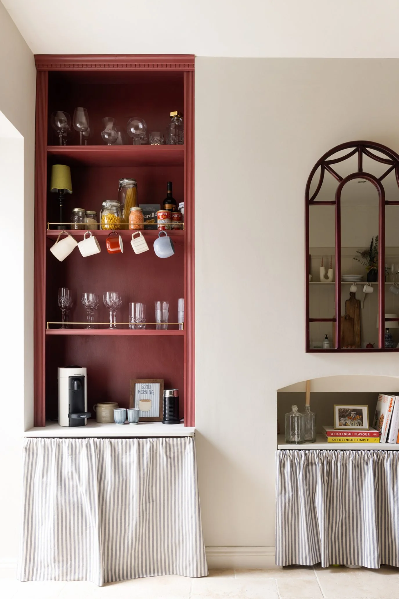
Photo credit: Rehome
In this kitchen, deep red has been used to transform an alcove and create a striking focal point. The colour scheme is continued through to the smaller alcove and mirror above, resulting in a cohesive, balanced look. The kitchen, by Rehome, is part of an open-plan, reinstalled pre-loved Mackintosh Shaker kitchen, and the homeowner has created extra storage in the alcove by adding shelves.
What I like about the shelving here is how the colour turns what could be a fairly plain wall into a standout feature. If you like this idea, take a look at the list of deep red shades from well-known paint companies at the beginning of this article to find the right colour for your own shelving.
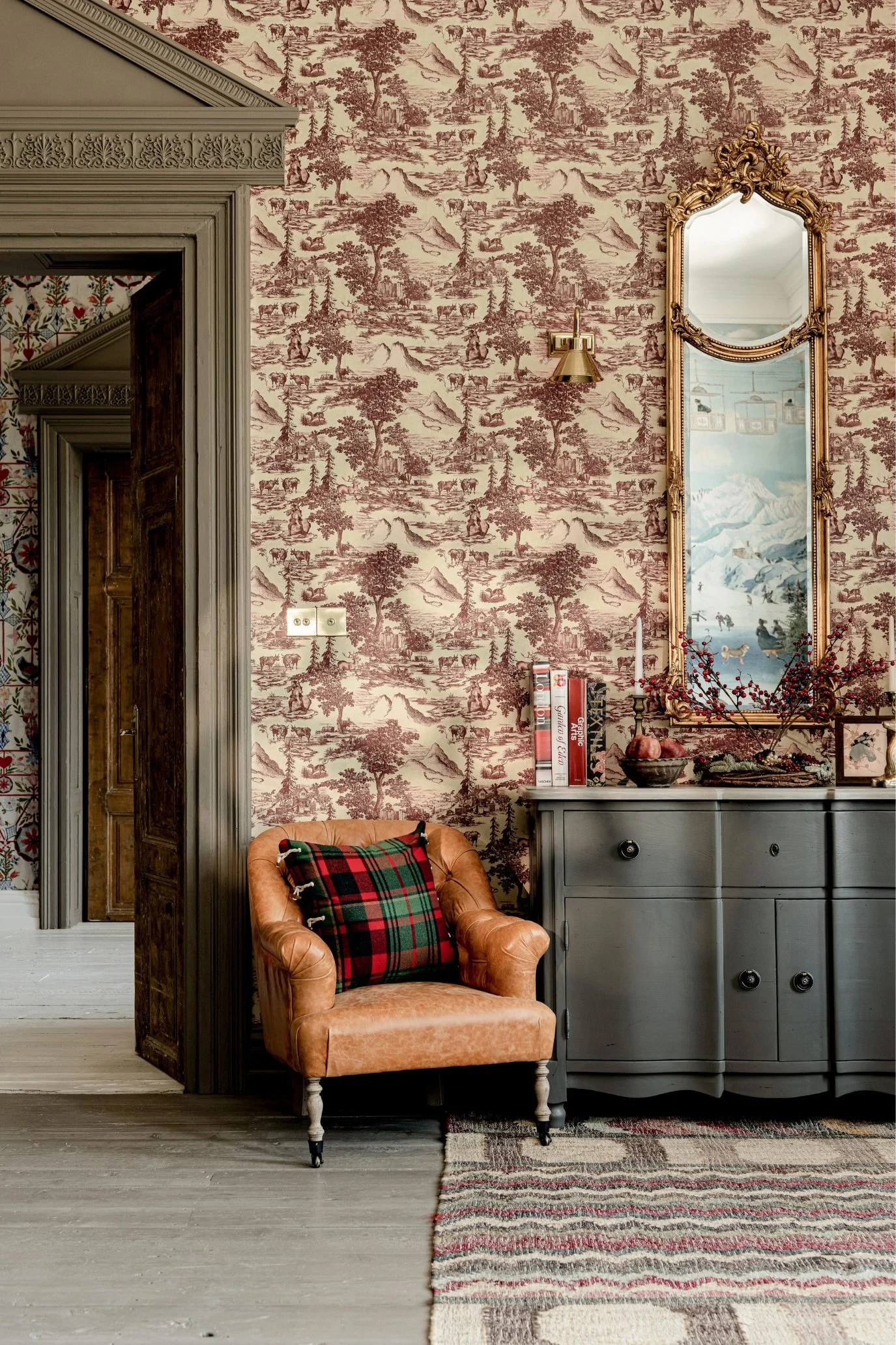
Photo credit: MINDTHEGAP
Wallcoverings are a more subtle yet still beautiful way to introduce deep reds to an interior scheme. This particular wallcovering from MINDTHEGAP is inspired by the timeless classic Toile de Jouy style, which first became popular in the late 18th century. It has been reinterpreted for the modern day with a Tyrolean twist.
Notice how deep red is repeated elsewhere in the room too, in a slightly different shade, through the rug and flowers. There are so many different wallcoverings to choose from, and you don’t have to paper the entire room. A single feature wall behind a bed, seating or dining area can bring colour and pattern into your scheme without overwhelming the room.
Deep red wall tiles
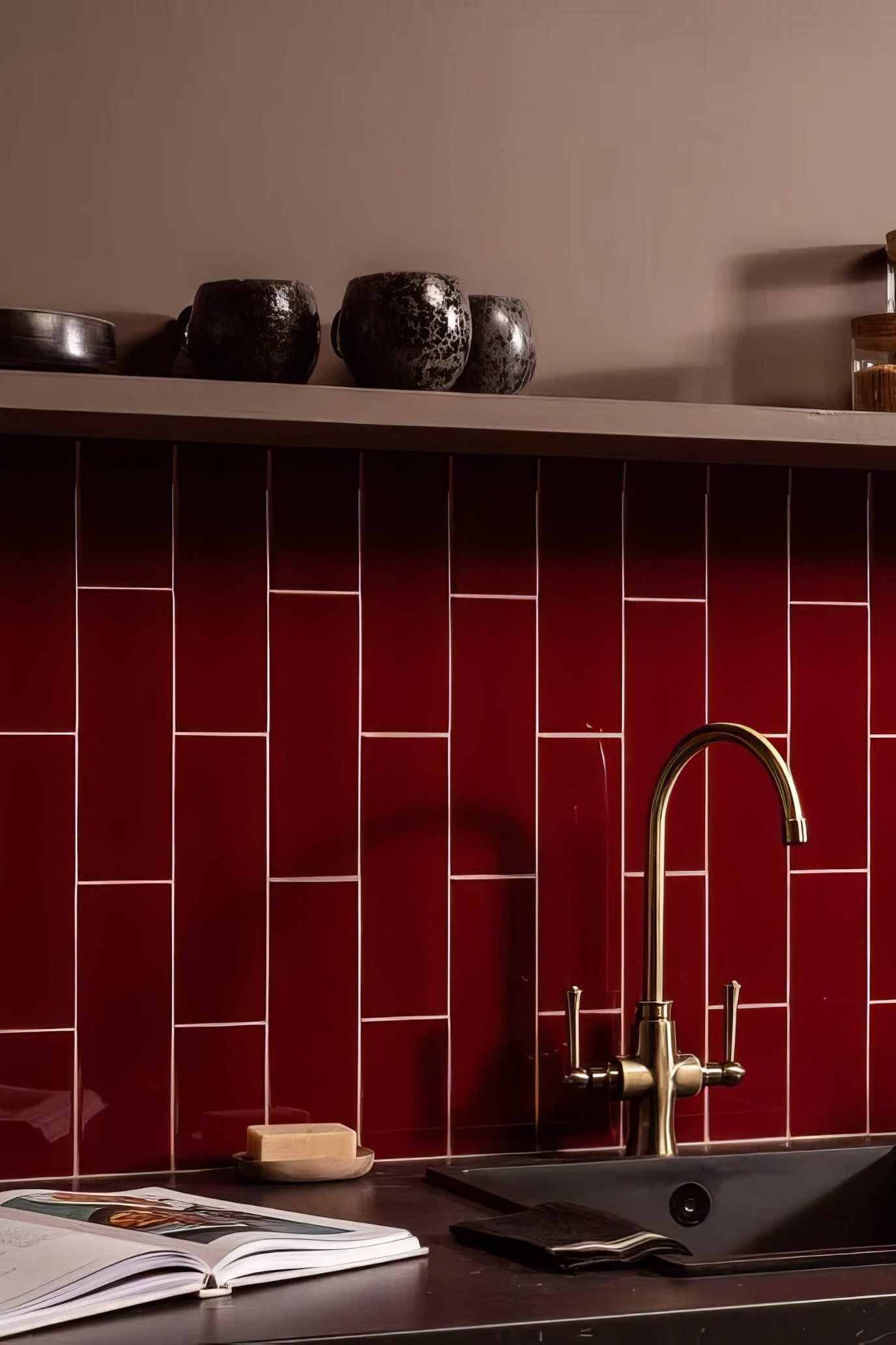
Photo credit: Hyperion Tiles
Tiles are a simple yet powerful way to introduce deep red into your interior, particularly in a kitchen, where the richness of the colour works so well with metallic finishes such as brass, bronze and warm-toned nickel. I especially like the tiles pictured here, as the deep red creates a striking backdrop and really sets off the brass tap.
These burgundy glazed brick tiles by Hyperion Tiles are designed to bring a deep, luxurious tone to the space, with the glazed finish picking up the light. If you like the idea of using burgundy and other wine- and berry-toned tiles, they can work just as well in a powder room, bathroom, kitchen or boot room, either as a splashback or on a larger area of wall.
Deep red cabinetry and shelf
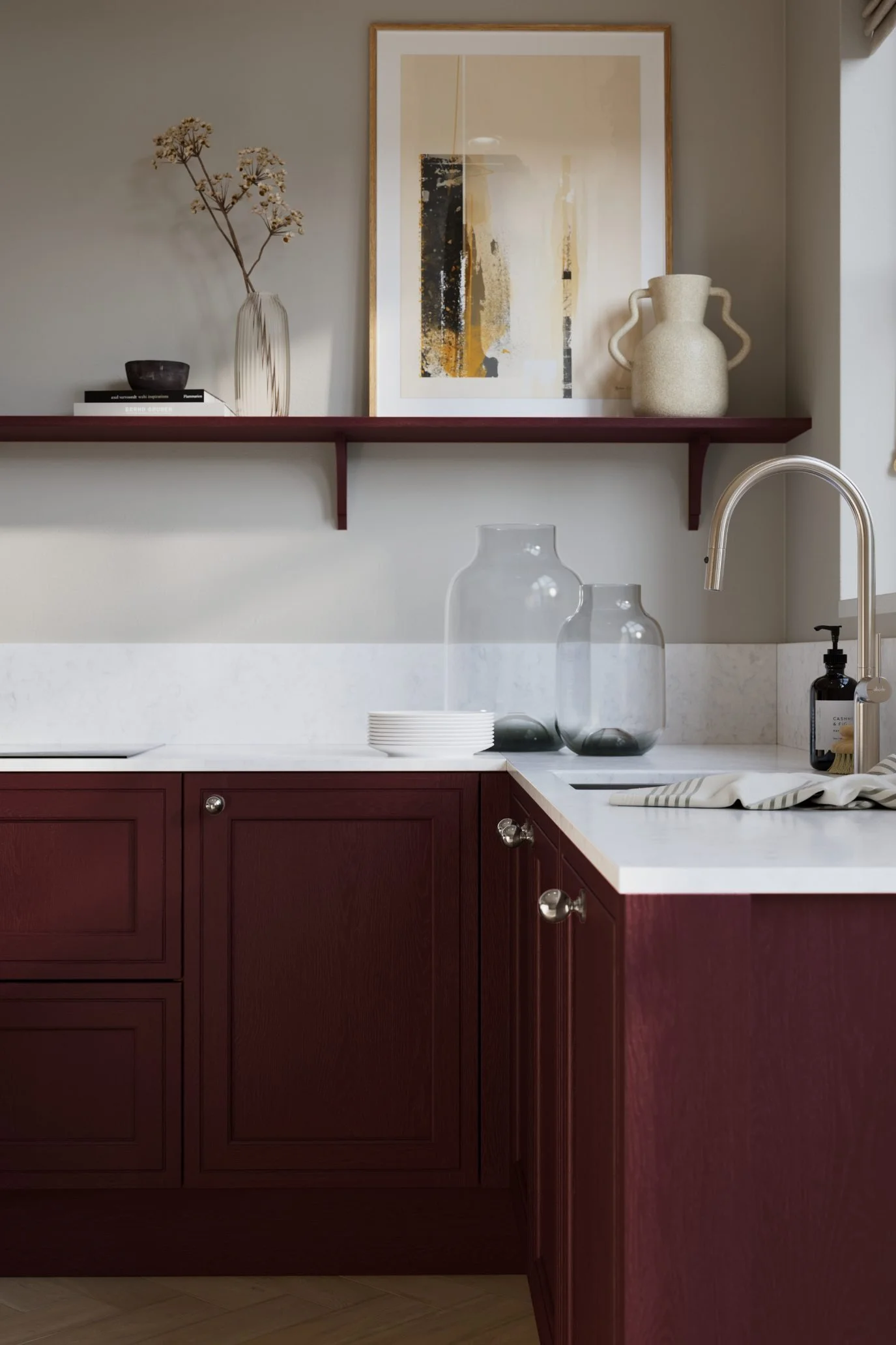
Photo credit: Magnet
Kitchen cabinetry painted in a richly toned wine or berry shade can look incredibly sophisticated, like the kitchen here from Magnet. If using the colours on the island feels too bold, then choose a lighter contrasting shade instead, which I personally think creates a more considered and balanced look than using the same colour everywhere.
I generally prefer open shelving to a whole row of high-level cabinets, and I particularly like the shelf pictured here, which has been painted in the same deep red as the lower cabinetry. Repeating the colour in this subtle way helps pull the kitchen together without making the scheme too overpowering.
Accessorising with deep reds
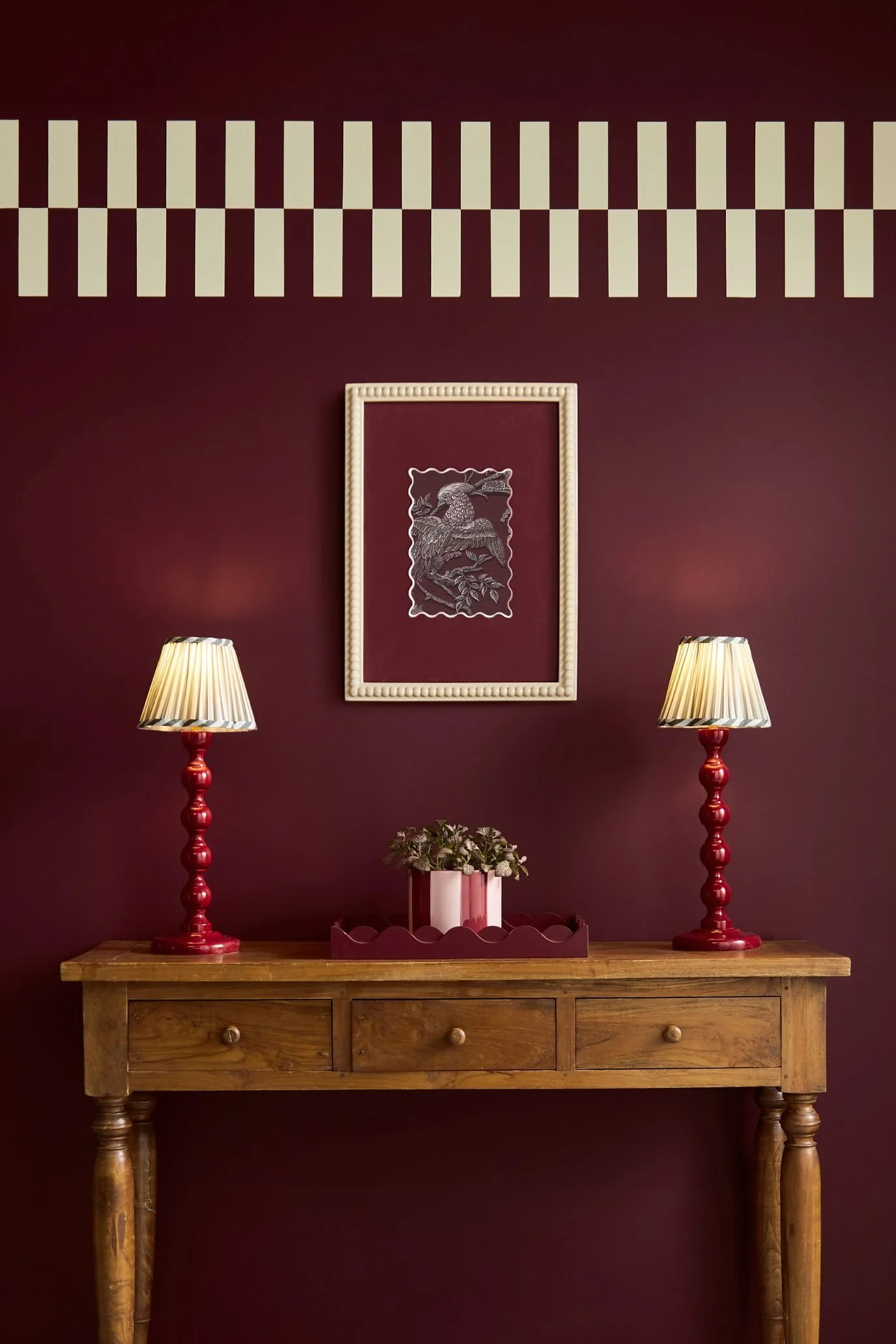
Photo credit: Graham & Brown
This opulent shade used in an entryway is Graham & Brown's Divine Damson, inspired by the lush tones of ripe damson and fig, and named the brand’s Colour of the Year 2026. The interior is a lovely example of how decorative accents in different shades of red can be layered together to create a harmonious scheme.
The wall evokes a moody backdrop, complemented by the brighter red lamps, while the tray and painting have deeper brown undertones and help the scheme look carefully considered rather than overly coordinated. As in the image below, the off-white lampshades and picture frame lift the darker palette and bring touches of light to the space.
Pairing deep red with off-white
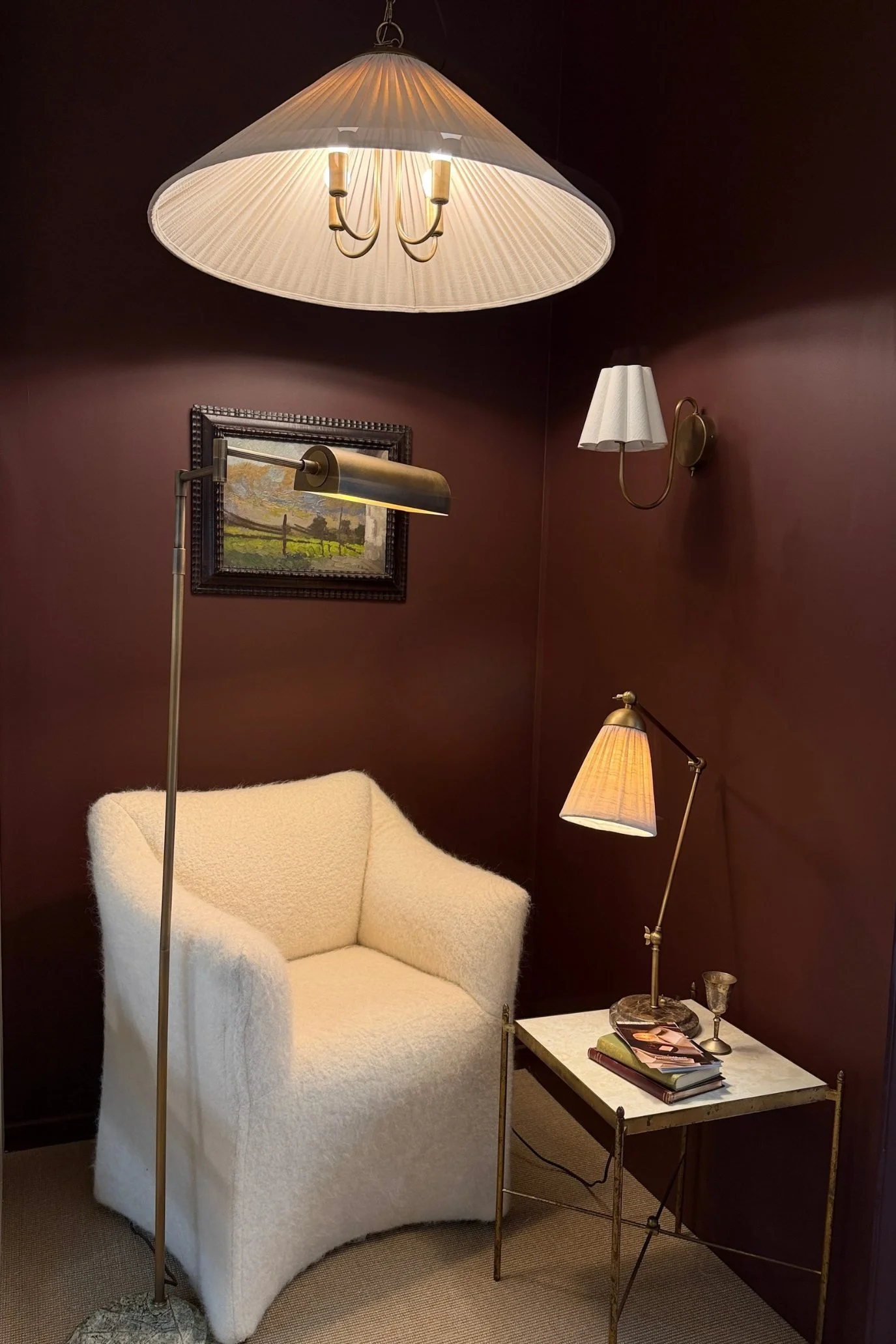
Photo credit: Sandra van Aalst
I took this photo myself at Design Week earlier this year, where lighting brand Lamps & Lights was showcasing its latest designs. It’s a perfect example of how beautifully deep red works with tactile soft off-white tones, from the fabric lampshades and marble tabletop to the bouclé chair.
Notice, too, how the metallic finishes really stand out against the darker backdrop. The overall effect is striking and sophisticated, with the moody merlot-toned wall creating the perfect foundation to highlight the lamps and chair.
Two-tone colour blocking in deep red
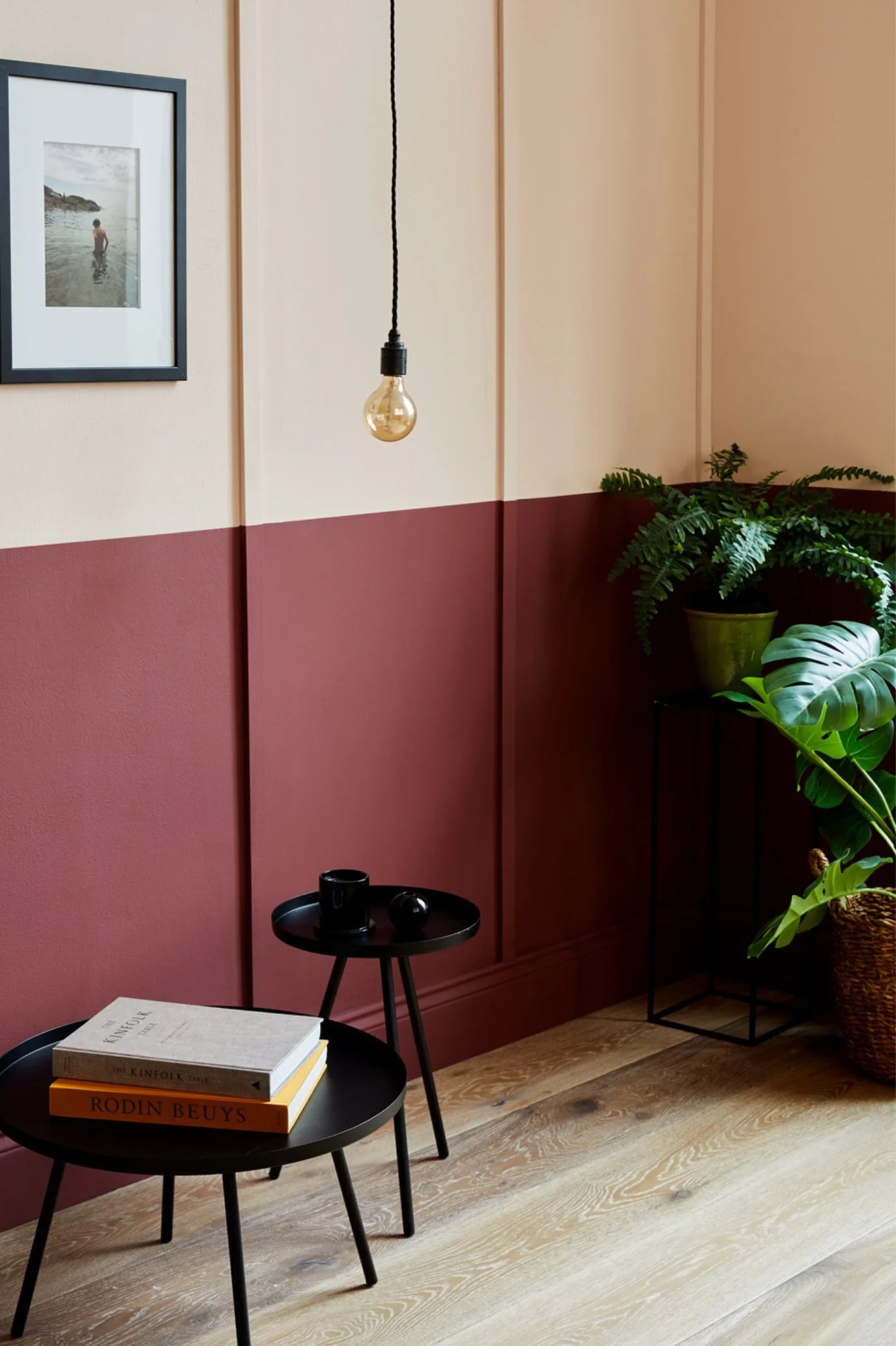
Photo credit: Earthborn
If colour drenching in deep red is too much, but you still want the colour on your walls, then this two-tone half-height wall is a great alternative. It feels far less overpowering, yet still brings the colour to the bones of a room rather than relying on just accessories. The shade shown here is Lady Bug by Earthborn, which is a richly toned burgundy and is paired with the lighter Peach Baby.
If you want to create your own two-tone wall, aim for around dado height, which is roughly 90cm to 1 metre from the floor. Use a spirit level and low-tack decorators’ tape to mark a straight line and divide the wall before painting.
Deep Red Rugs
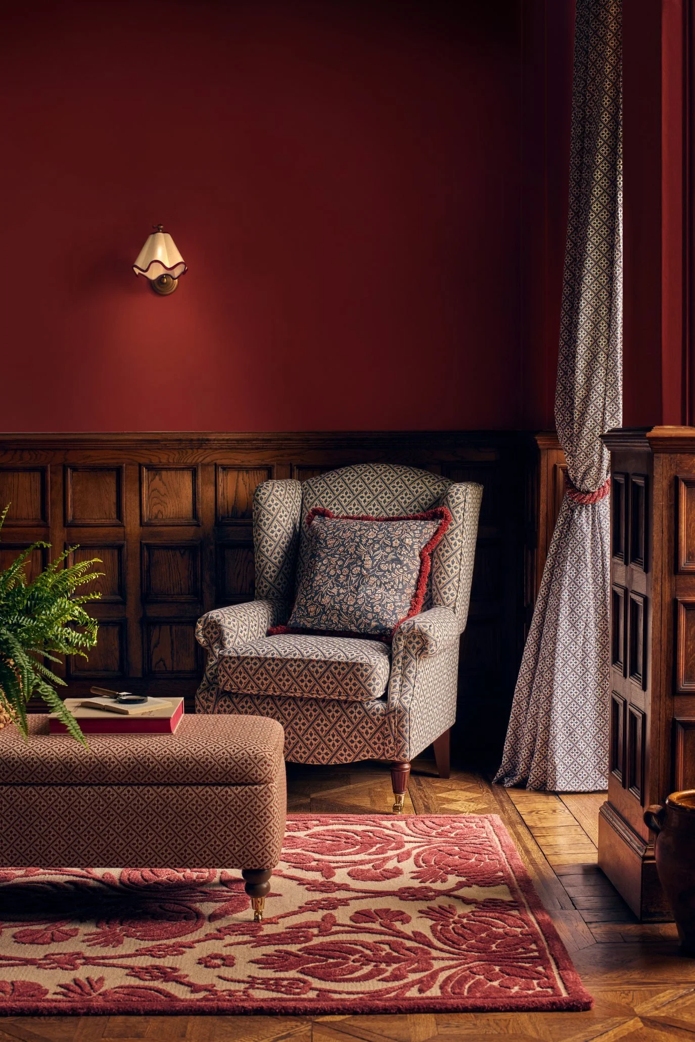
Photo credit: Laura Ashley
This living room not only features a half-height wall painted in a deep crimson shade above the panelling, but it is also layered with jewel-toned red accessories. Grounding the space is the super-soft wool and viscose rug, with its raised red-toned pattern adding texture and softness underfoot. The red is carried through to the ottoman, cranberry-red rope tie-backs, and the dark crimson cushion. All are from Laura Ashley and together help create an inviting and cohesive interior.
When redecorating my own living room, I used a similar approach with terracotta but kept the walls off-white. I introduced the colour through the rug, cushions, throws and a lamp, building a strong colour story without painting it on the walls.
Framed prints in wine-inspired hues
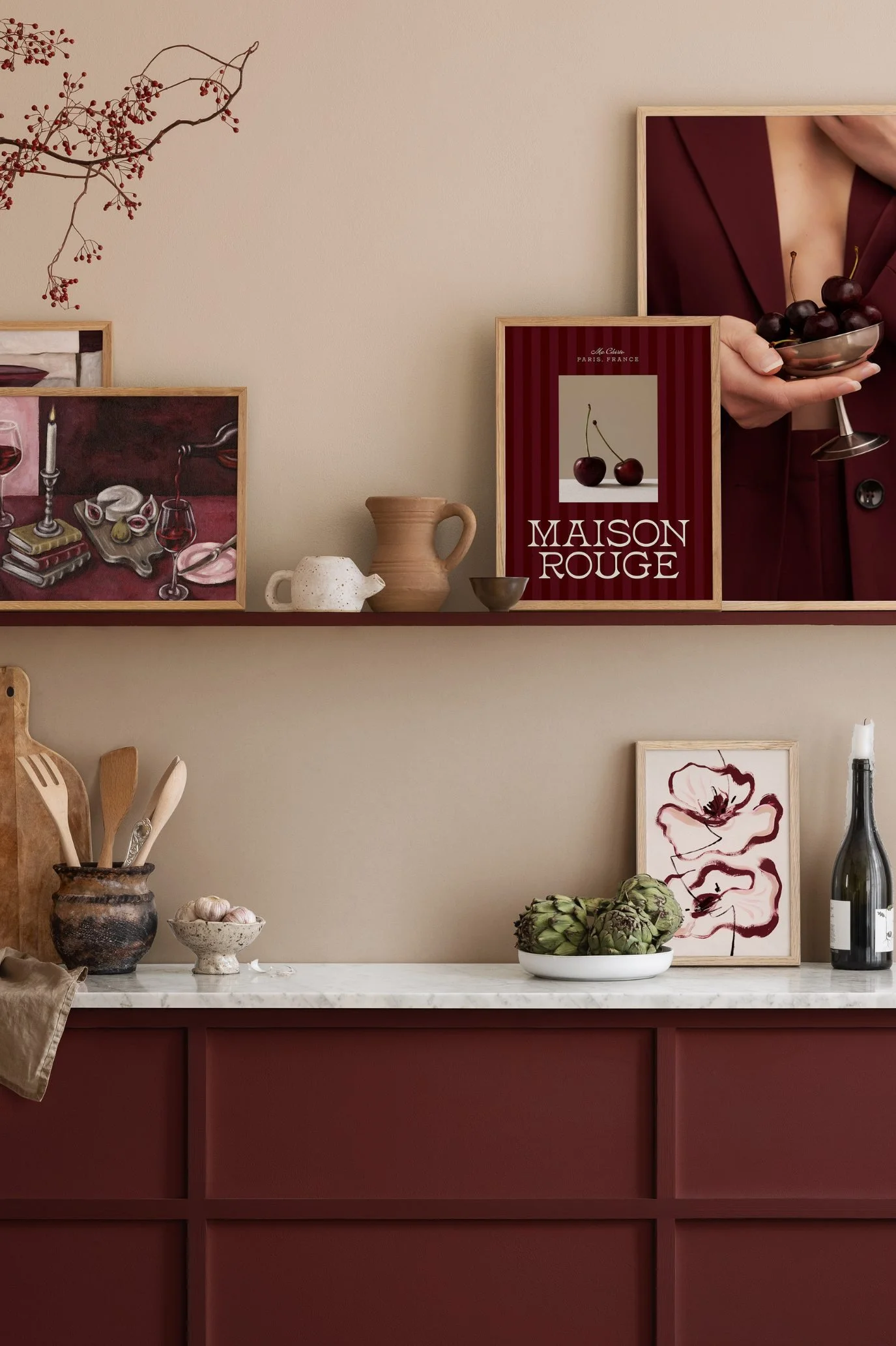
Photo credit: Desenio
If you decide to paint your kitchen cabinetry or a shelf in a deep red, these burgundy wine-themed prints from Desenio are the perfect style of artwork to complement your scheme. Mix different sizes and either lean them casually against the shelf or worktop for a relaxed look, or hang them on the wall for something a little more formal.
Even if your kitchen is a completely different colour, artwork is the way to bring in a touch of deep red. And if you already have burgundy, merlot or another rich red in another nearby room, a print is one of the simplest ways to create flow between the spaces.
Deep red soft furnishings
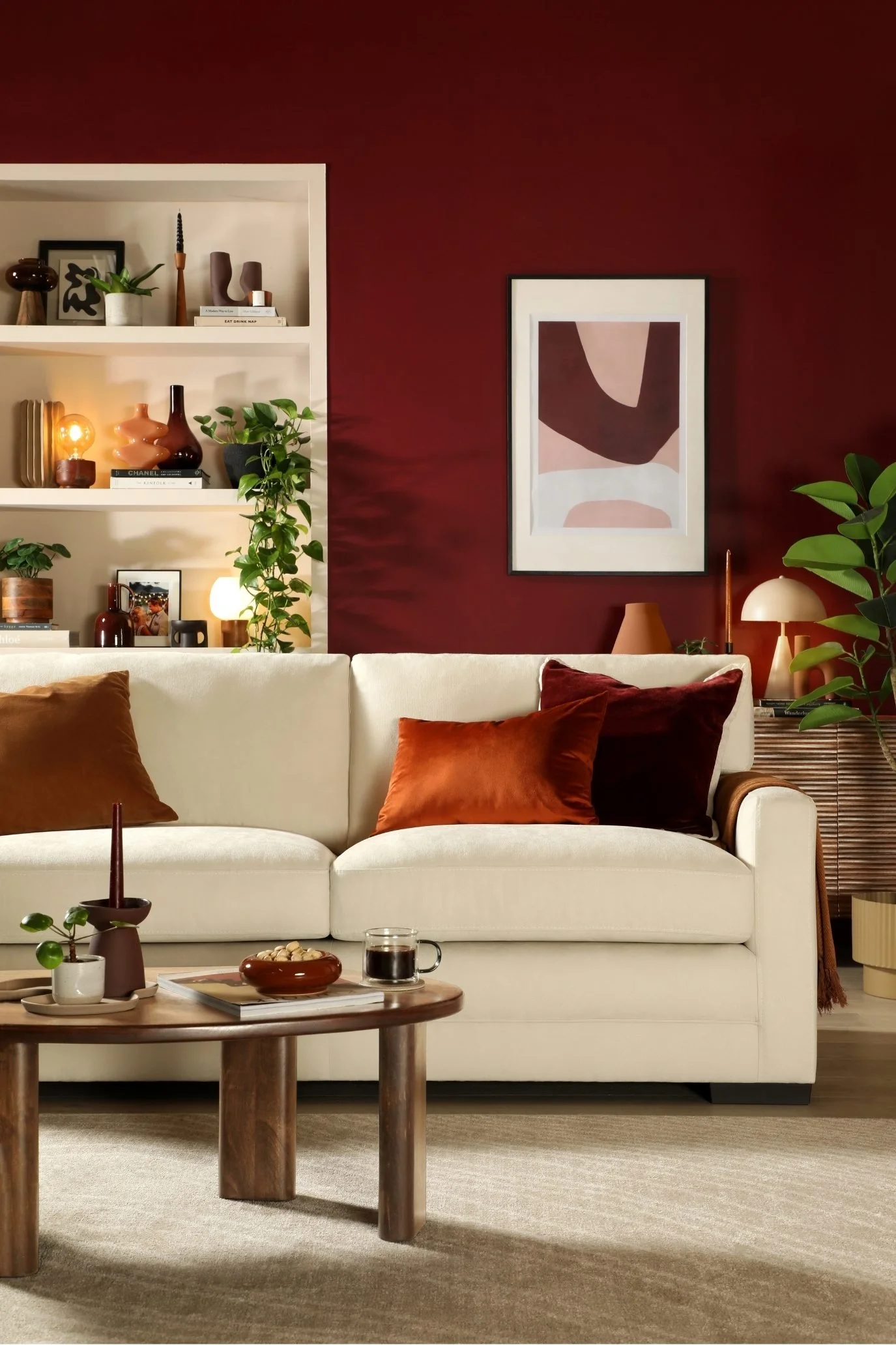
Photo credit: Furniture And Choice
In this living room the walls are painted in a rich red, but I wanted to draw your attention to the cushions and the way their colours connect with other elements in the room, creating a cohesive interior and bringing red into the room in an understated way.
Burgundy tones have been paired with different shades of brown across the cushions and other decorative pieces, including a throw, vases, vessels and table lamps on the shelving. There are also several wood elements, such as the coffee table, lamp bases and pots, which complement the mix of burgundy and brown beautifully, adding warmth, texture and a touch of nature to the room. The off-white sofa by Furniture and Choice, together with the pale shelving, brightens the whole scheme and once again shows how well off-white and warm brown work with richly toned deep reds.
Deep red flowers
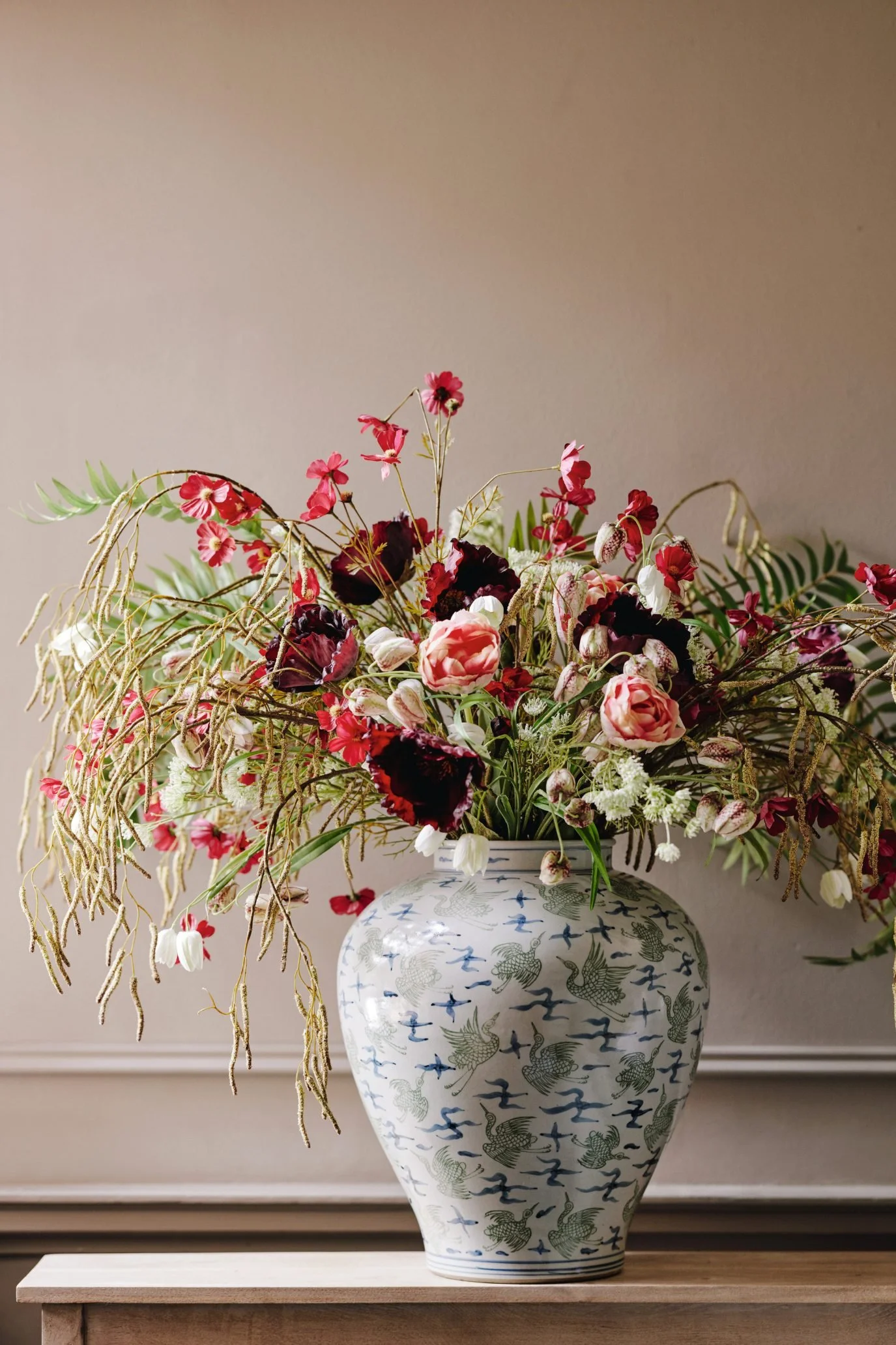
Photo credit: OKA
Last but not least, one of the easiest ways to introduce an accent of deep red is through flowers, either alone or mixed with a few stems of foliage, like the arrangement pictured here from OKA. Small touches of deep red can look even more effective when teamed with another element elsewhere in the room, such as a cushion, lamp or piece of artwork.
You don’t need to buy real flowers either. Artificial blooms, especially in rich shades, can look surprisingly realistic and will last for years. The bunch pictured here from OKA is a lovely example. If you’d like to find out more about styling with faux flowers, head over to my recent feature Faux Flowers: Beautiful Artificial Blooms for the Home.
LET’S SUM UP
I hope this article has given you an idea of how you can introduce merlot and burgundy and other berry- and wine-inspired hues into your home. If you would like to read about how to decorate and style with off-white, head over to my feature:
Cloud Dancer (Pantone Colour of the Year 2026): How to Style with Off-White in Your Home
And if you’d like to see a home colour drenched inside and out, check out my recent article:
Inside an Extraordinary Art-filled Home Colour-drenched in Soft Olive Green
I’m Sandra, an interior writer, stylist, photographer for interior magazines and a Sunday Times best-selling author, sharing ideas to help you style your home with confidence and ease.
If you love interiors and want your home to feel stylish, pulled together, yet still personal, you’ve come to the right place. I’ll be sharing styling advice to help you edit, layer, and finish your home with confidence, alongside articles on what’s happening in the interiors world — from design events and colour stories to features on interior gurus.
I also take you on tours of beautifully styled homes from around the world, offering inspiration and styling ideas to steal for your own space. Ultimately, I’ll show you how a little bit of styling can be transformational and take your home to a whole new level.
If you’d like to find out more about me click here